1.4.3 Exercises
Make a bar plot of species of penguins, where you assign species to the y aesthetic.
── Attaching core tidyverse packages ──────────────────────── tidyverse 2.0.0 ──
✔ dplyr     1.1.2     ✔ readr     2.1.4
✔ forcats   1.0.0     ✔ stringr   1.5.0
✔ ggplot2   3.4.3     ✔ tibble    3.2.1
✔ lubridate 1.9.2     ✔ tidyr     1.3.0
✔ purrr     1.0.2
── Conflicts ────────────────────────────────────────── tidyverse_conflicts() ──
✖ dplyr::filter() masks stats::filter()
✖ dplyr::lag()    masks stats::lag()
ℹ Use the conflicted package (<http://conflicted.r-lib.org/>) to force all conflicts to become errors
library (palmerpenguins)|> ggplot (aes (y = species)) + geom_bar ()
How is this plot different? It’s different b/c …
Question (2)
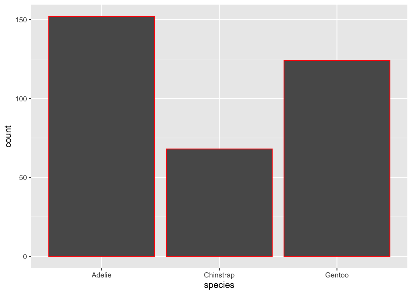
How are the following two plots different? Which aesthetic, color or fill, is more useful for changing the color of bars?
ggplot (penguins, aes (x = species)) + geom_bar (color = "red" )
ggplot (penguins, aes (x = species)) + geom_bar (fill = "red" )
What does the bins argument in geom_histogram() do?
Make a histogram of the carat variable in the diamonds dataset that is available when you load the tidyverse package. Experiment with different binwidths. What binwidth reveals the most interesting patterns?


