# get the working diretory
getwd()
# set the working directory
# note: Windows users, use forward slash \
setwd("enter your directory here")Sections 1.4-1.5
Visualizing distributions & relationships
ATUS Data
Learn more and extract different data below: American Time Use Survey
Our ATUS data concerns sex, age, race, stress & work
Download
Prepare to download the data into your Dat309 folder (not Samba!), or a suitable sub-directory.
Download the codebook, the ddi file and the zip file. ddi codebook .zip
Use the codebook to parse meaning from the variables. You need the ipumsr package to load the data into R.
# load ATUS data
# The data requires the IPUMSr package
library(haven)
library(ipumsr)
ddi <- read_ipums_ddi("ATUS2/atus_00002.xml")
data <- read_ipums_micro(ddi)
Exploratory Questions
- What is the size of the data? How many rows & columns? (Use
dim(), for dimension.) - What do the numbers mean in the rows?
- What are the variable names and what do they mean?
The (very useful) clean_names() function makes the variable names a bit easier to read.
# filter to get stress data
#| eval: TRUE
library(tidyverse)
library(janitor)
ds <- clean_names(data)
ds <- filter(ds,scstress < 10)
The variable pertaining to “kind of job” was poorly named, so we change it.
# rename work variable
#| eval: FALSE
ds <- filter(ds,scstress < 10)
ds <- rename(ds,"job" = occ2_cps8)
Filter
Choose a few jobs so the data isn’t so big. Learn what how the numbers relate to jobs in the codebook.
dmsf <- filter(ds,job == 120 | job == 122 |job == 132)
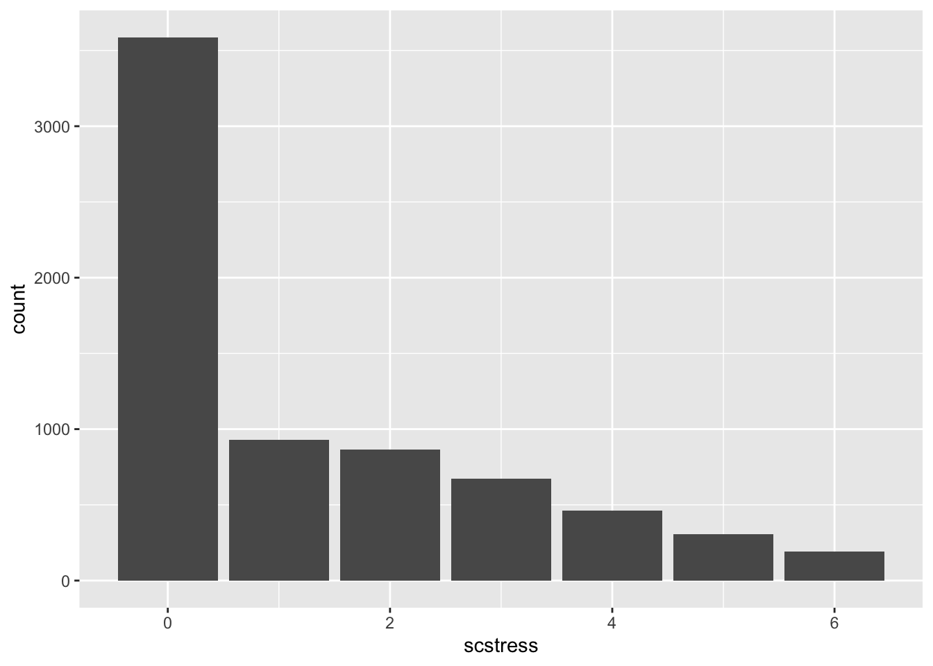
ggplot(dmsf,aes(x=scstress)) + geom_bar()
Visualizing Distributions & Relationships
See examples in text (i) Categorical distribution: bar plot
Exercise
- Improve the plot below with
fill = as_factor(job)from thehavenpackage.
- Add a
position = "fill"to the geom_bar(). Does it help?
dmsf <- filter(ds,job == 120 | job == 122 |job == 132)
ggplot(dmsf,aes(x=scstress, fill = job)) + geom_bar() +
  labs(fill = "Job")
Numerical distribution: histogram, density plot
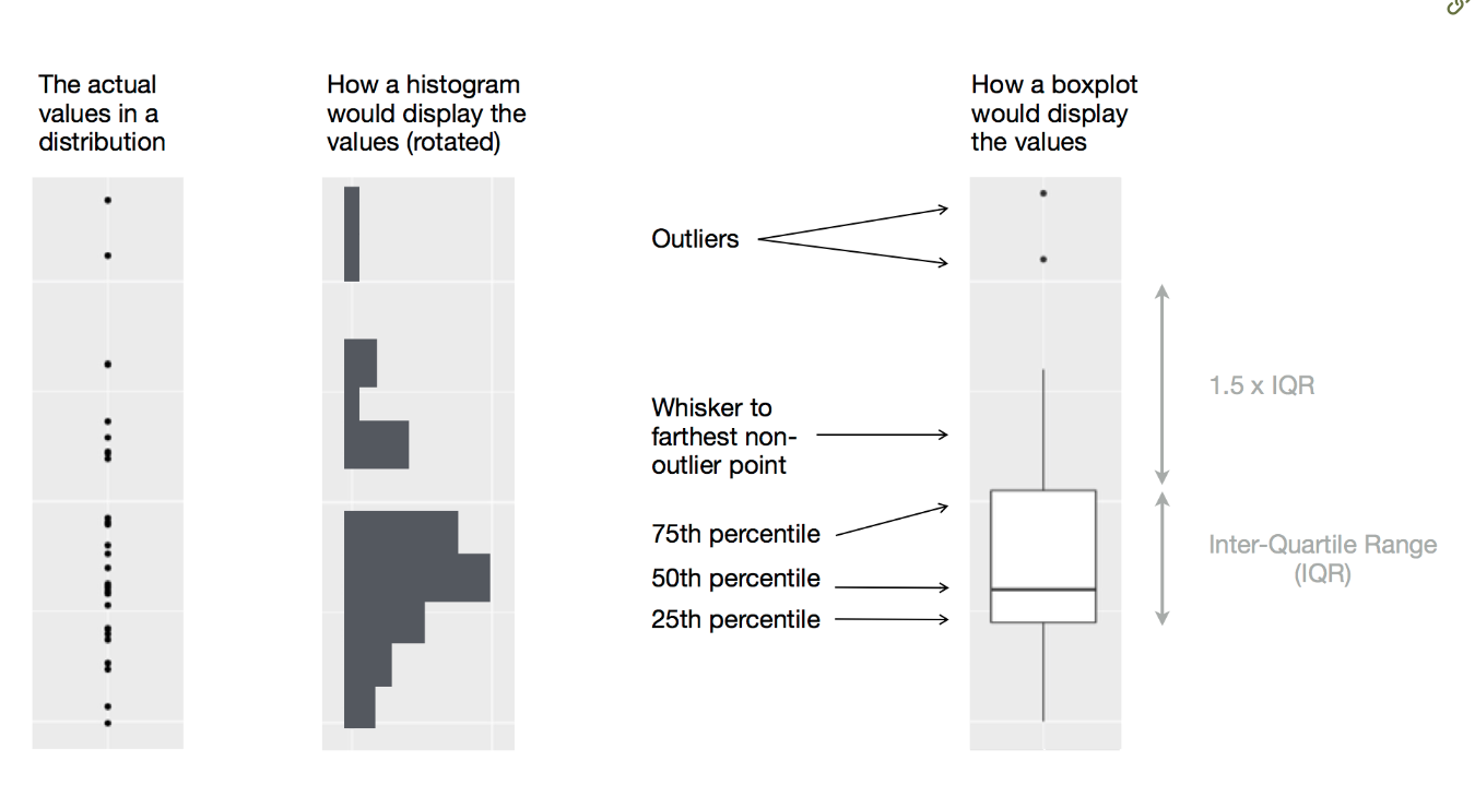
Categorical / Numerical relationship: box plot, density

Two categorical variables: barplot filled with color or the same with
position = "fill"in the geom.Two-Three numerical variables: scatter plot with colors mapped to a variable. (see text)
Just a few categorical variables? Try faceting:
Exercise:
- Are the
happyandstressvariables correlated?
Factors
- Remove
factor()from thefill = factor(job)and observe the result. - Replace it with
fill = haven::as_factor(job)library) and observe. The syntax above is a way of using theas_factorfunction without loading the Haven library that caused problems earlier with data-typing.
Exerises:
- Textbook: 1.5.5 (Due: Sept. 9)
- Practice what you learned in 1.4-1.5 to the ATUS data.