# load and clean_names NMU data
nmu <- read.csv("http://euclid.nmu.edu/~joshthom/Teaching/DAT309/Week6/10%20BOS%2010%20Year%20History%20Deidentified%2010.3.23.csv", sep  = "\t")
nmu <- janitor::clean_names(nmu)EDA w/NMU enrollment data
gganimate
Create animated .gifs from data.
# install.packages("gganimate")
# library(gganimate)

  ggplot(nmu, aes(x = department, fill = gender)) +
    geom_bar() +
      theme(axis.text.x = element_text(angle = 60, hjust = 1 )) +
    labs(title = 'Year: {closest_state}',
                  x = 'Departments',
                  y = 'Enrollment') +
    transition_states(states=year,
                      transition_length = 1,
                      state_length = 4) +
    enter_fade() +
    exit_fade() +
    ease_aes('linear')

  last_animation()
  anim_save("anim_save("~/Google Drive/Teaching/DAT309/Week7/nmu_10yr_all.gif)
View the animation [here] ## Facets (10.4)
Two ways to make subplots, facet_wrap() and facet_grid(). For facet_grid, the first argument is again a function but in the syntax var1_row ~ var2_col.
suppressPackageStartupMessages(
  library(tidyverse)
)
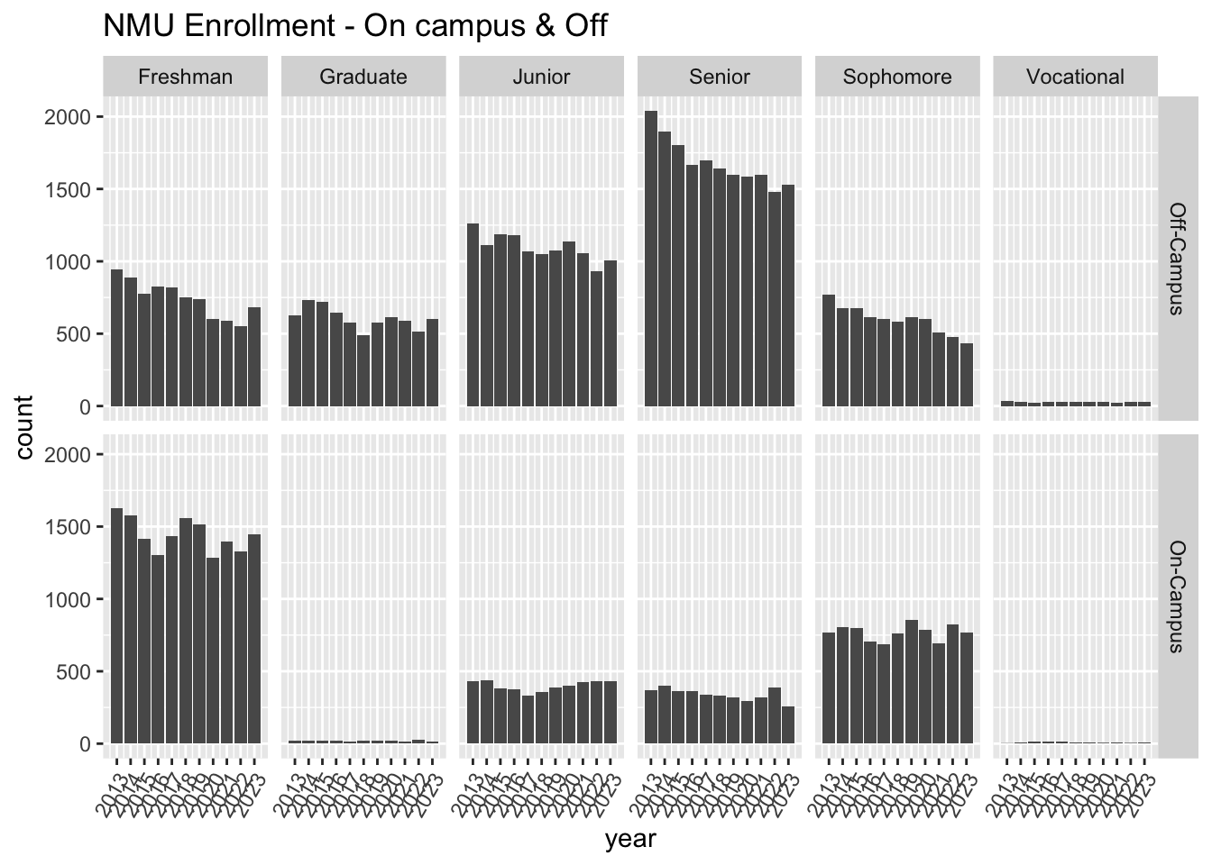
ggplot(nmu, aes(x = year)) +
  geom_bar() +
  facet_grid(housing ~ class_level) +
  scale_x_continuous(breaks = seq(2013, 2023, 1)) +
  theme(axis.text.x = element_text(angle = 60, hjust = 1)) +
  labs(title = "NMU Enrollment - On campus & Off")
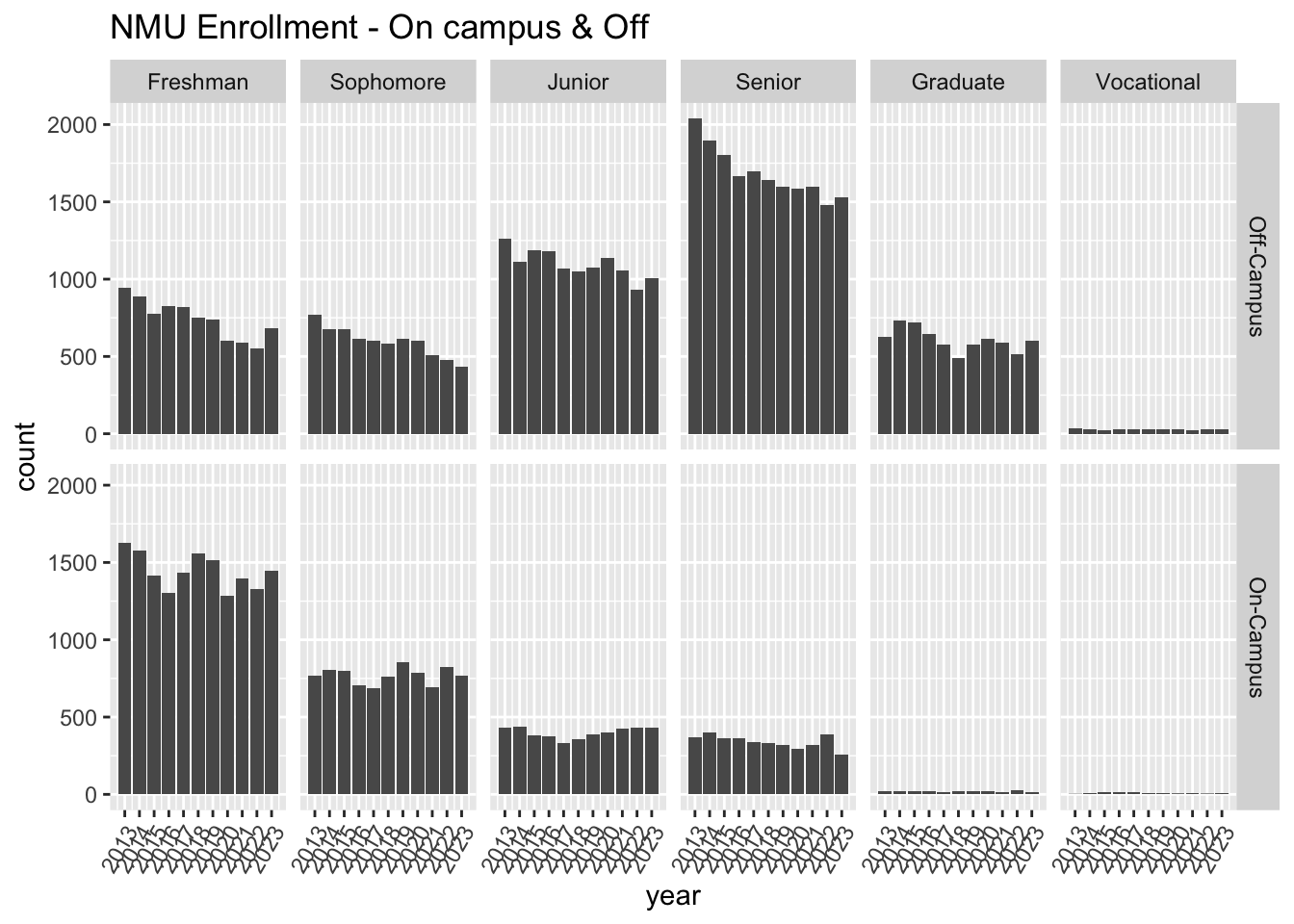
I don’t like the ordering of class level, let’s fix it.
nmu <- mutate(nmu,class_level =
                factor(class_level,
                       levels = c("Freshman","Sophomore",
                                  "Junior","Senior",
                                  "Graduate","Vocational")))

ggplot(nmu, aes(x = year)) +
  geom_bar() +
  facet_grid(housing ~ class_level) +
  scale_x_continuous(breaks = seq(2013, 2023, 1)) +
  theme(axis.text.x = element_text(angle = 60, hjust = 1)) +
  labs(title = "NMU Enrollment - On campus & Off")
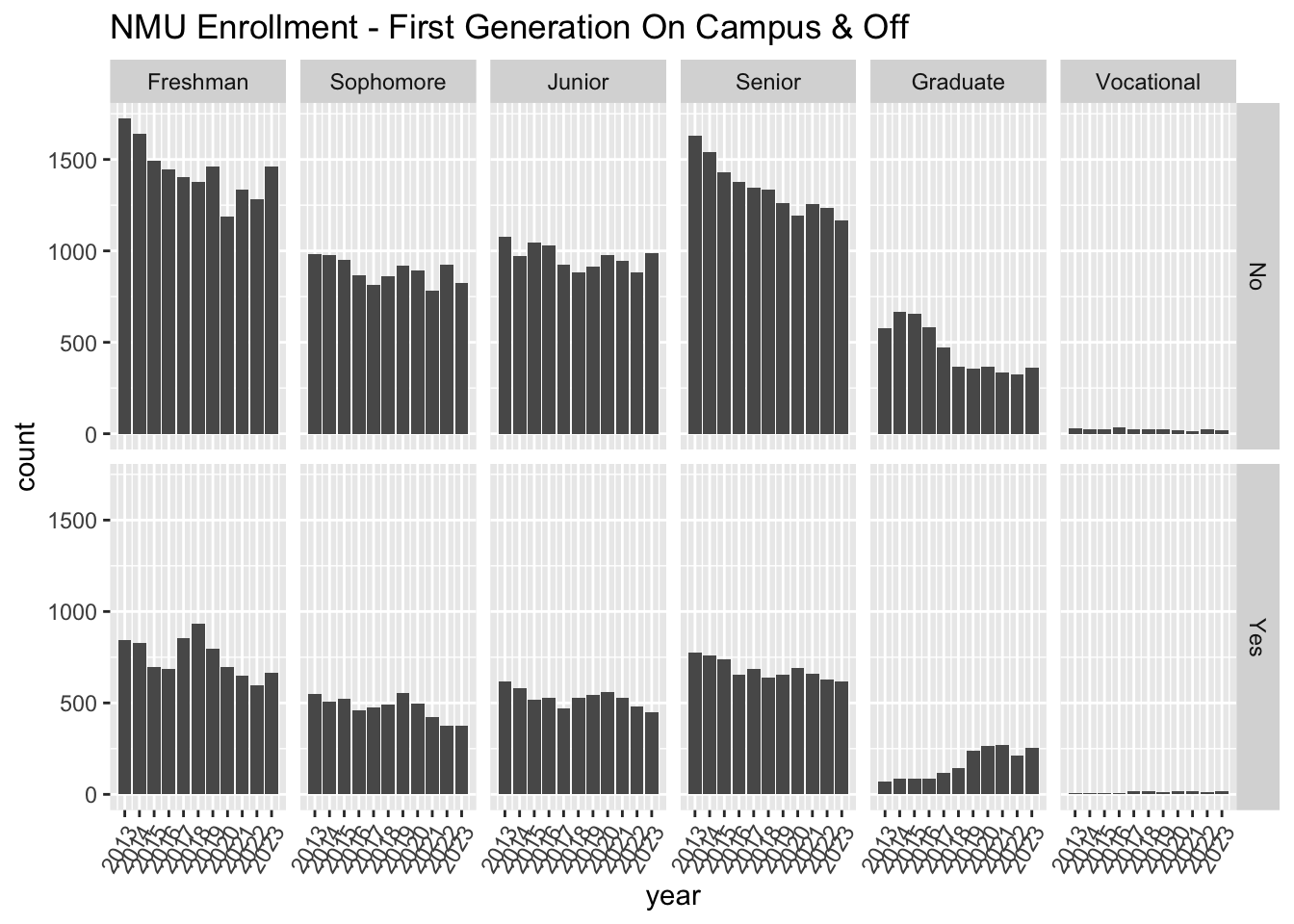
Change Y to Yes, and blank to No
nmu <- mutate(nmu,first_generation = if_else(first_generation == "Y","Yes","No"))To zoom in we “free up” the scales from their locked default position.
ggplot(nmu, aes(x = year)) +
  geom_bar() +
  facet_grid(first_generation ~ class_level) +
  # explore scales = "free" above
  scale_x_continuous(breaks = seq(2013, 2023, 1)) +
  theme(axis.text.x = element_text(angle = 60, hjust = 1)) +
  labs(title = "NMU Enrollment - First Generation On Campus & Off")
Exercise
Experiment with the parameter
nrowinfacet_grid.Experiment by changing the formula to
. ~ class_levelandclass_level ~ .
Exploratory Data Analysis w/ NMU data
Identify enrollment by housing (On campus or Off)
# count enrollment by housing
nmu_housing_year <- nmu |>
  group_by(year, housing) |>
  summarize(n = n()) |>
  ungroup()

# pivot so that rows correspond to years
year_vs_housing <- nmu_housing_year |>
  pivot_wider(
    names_from = housing,
    values_from = n) |>
  janitor::clean_names()
Compute year-to-year differences for each class
year_vs_housing <- mutate(year_vs_housing,
        on_campus_diff = c(NA,diff(year_vs_housing$on_campus)))
year_vs_housing <- mutate(year_vs_housing,
        off_campus_diff = c(NA,diff(year_vs_housing$off_campus)))
Pivot the differences into one variable & pivot their names into another variable.
nmu_diffs <- year_vs_housing |>
  pivot_longer(
    cols = contains("diff"),
    names_to = "housing_diffs",
    values_to = "diffs")
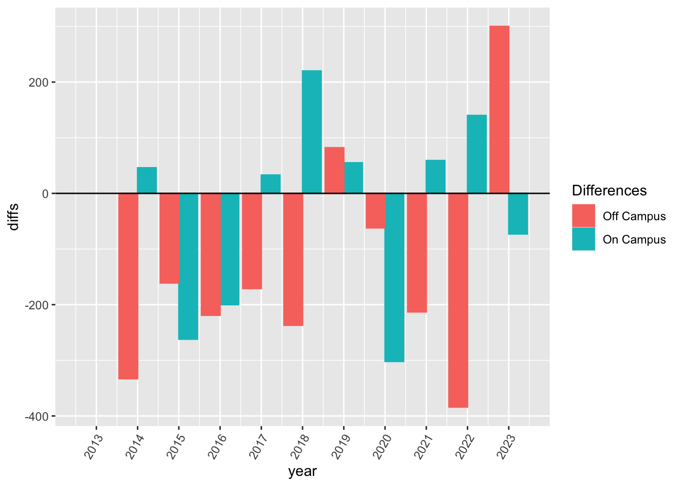
Plot year to year differences for each housing.
ggplot(nmu_diffs,
       aes(x = year, y = diffs,
           group = housing_diffs,
           color = housing_diffs,
           fill = housing_diffs,
           )) +
  geom_bar(position = "dodge", stat = "identity") +
  scale_x_continuous(breaks = seq(2013, 2023, 1)) +
  scale_fill_discrete(labels = c("Off Campus","On Campus")) +
  scale_color_discrete(labels = c("Off Campus","On Campus")) +
  theme(axis.text.x = element_text(angle = 60, hjust = 1)) +
  labs(fill = "Differences", color = "Differences") +
  geom_hline(yintercept = 0)
Exercises
Vary the geom usage above. Which is the most useful?
Repeat the anaylsis above for
genderinstead ofclass_levelAdd a position argument (eg,
"identity", "fill", "dodge) to the geom above.