library(tidyverse)
# h1 is honors students by department
# h2 is all  students by department
nmu <- read_csv("https://euclid.nmu.edu/~joshthom/Teaching/DAT309/Week7/Honors/h1.csv")
Position Adjustments
Warm-up: Data in the News
- Follow this link.
- Exercise: re-create the plot.
- Click on the Source link in the caption, then scroll down to the caption and follow the Get the data link.
NMU Honors data
Position Arguments: Stacking
Know what each of these do with a barplot: geom_bar(position = "...") i) “identity” ii) “dodge” iii) “fill” iv) “stack
Create something like this, but use Honors / No Honors instead of Class Level.
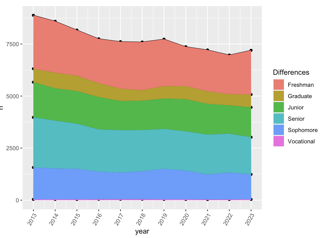
Read the following tips from the reference page on stacking
Variation
Tendency of variable to change within a dataset. Display the variation of some variables within the diamonds included with R. The displays below use cowplot, see this vignette for more details.
install.packages("cowplot")# variation of the price of diamonds in this data
library(cowplot)
library(tidyverse)
# count the number of rows (diamonds) in the data
diamonds |> count()# A tibble: 1 × 1
n
<int>
1 53940prs <- ggplot(diamonds, aes(x = price)) +
geom_histogram(binwidth = 100)
crt <- ggplot(diamonds, aes(x = carat)) +
geom_histogram(binwidth = .25)
plot_grid(prs,crt,labels = "AUTO")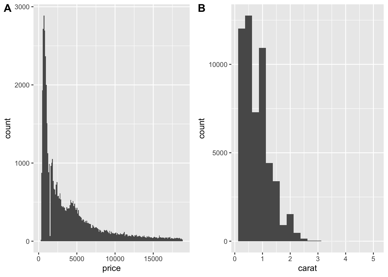
Typical Values
In both histograms and bar charts - tall bars means lots of data, thus values that are very common. Short bars less common. No bars mean no data.
Which values are the most common? Why?
Which values are rare? Why? Does that match your expectations?
Can you see any unusual patterns? What might explain them?
Visualizations can reveal clusters.
Clusters for one variable: concentration in the distribution
Clusters of multiple variables: high co-variation
Questions concerning clusters
How are the observations within each subgroup similar to each other?
How are the observations in separate clusters different from each other?
How can you explain or describe the clusters?
Why might the appearance of clusters be misleading?
Unusual values
During our EDA, we encounter the plot below. The large blank area in the x-axis seems suspicious. There are several ways to explore this suspicion.
- Zoom-in to see more via
coord_cartesianorylimandxlim. - Create a small dataset that shows more detail about the unusual values.
Explore both of these strategies now.
#
ggplot(diamonds, aes(x = y)) +
  geom_histogram(binwidth = 0.5)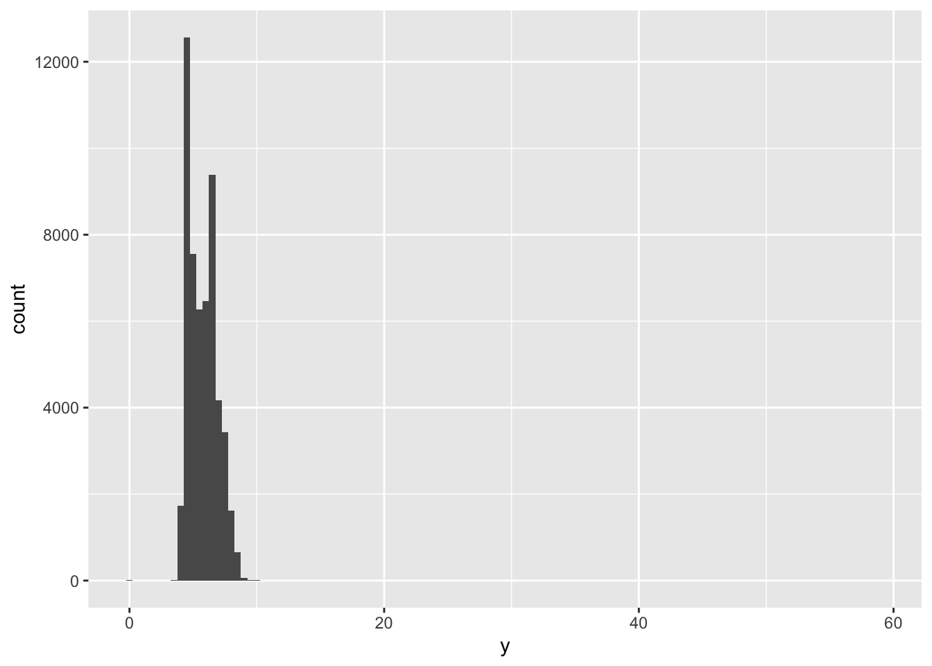
What do we do about the anomalous values?
- Remove the entire row:
diamonds2 <- diamonds |>
filter(between(y, 3, 20))- Replace the unusual values with NAs (missing values).
diamonds2 <- diamonds |>
  mutate(y = ifelse(y < 3 | y > 20, NA, y))
Recall, ggplot() does not plot NA’s but does warn you about them, unless you do this:
ggplot(diamonds2, aes(x = x, y = y)) +
  geom_point(na.rm = TRUE)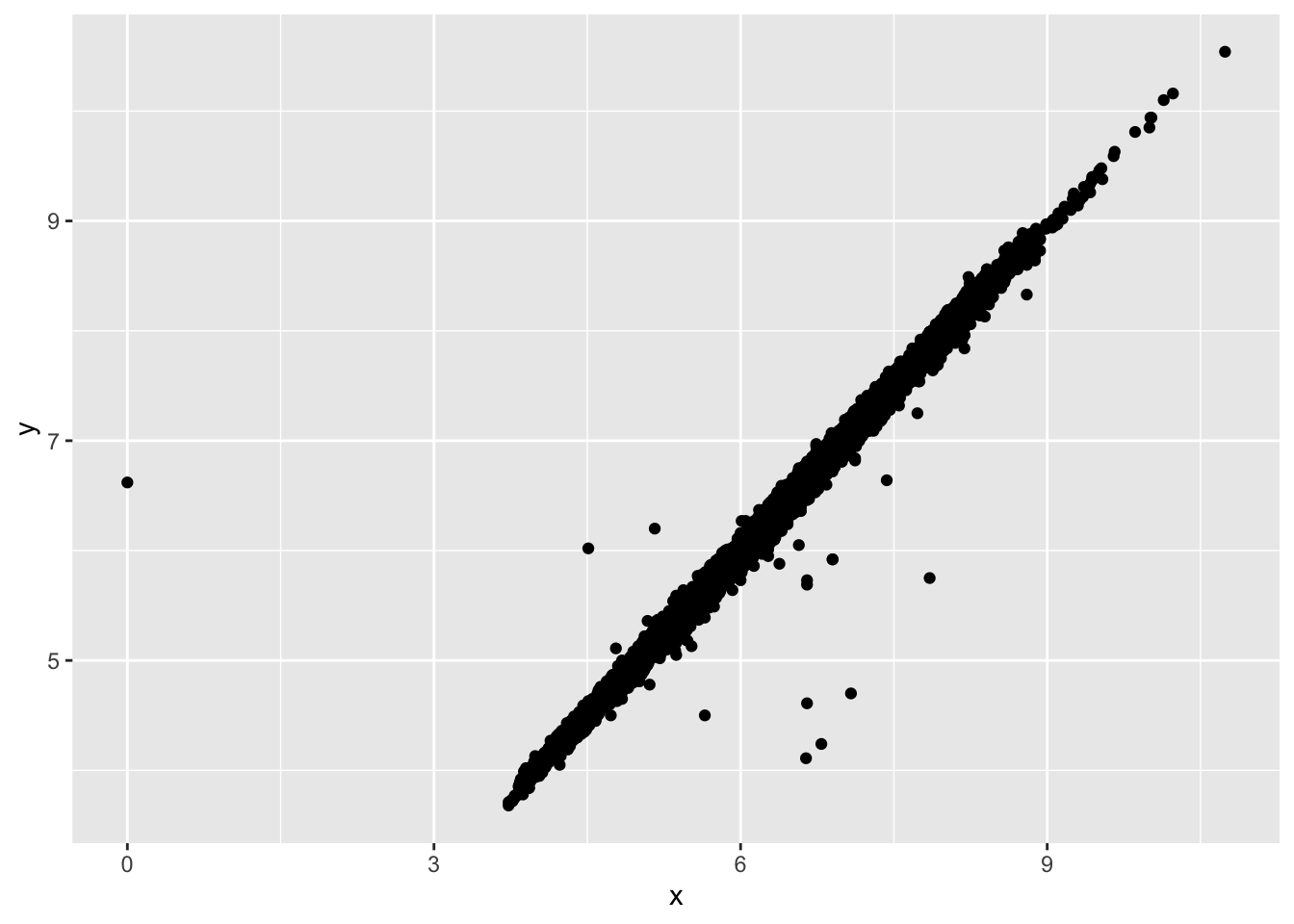
Co-variation
Co-variation is the tendency of multiple variables to vary in a related way, it is evidence of relationships between variables.
Relationship b/w categorical and numerical variable
# histogram of price, colored by cut
ggplot(diamonds, aes(x = price)) +
  geom_freqpoly(aes(color = cut), binwidth = 500, linewidth = 0.75)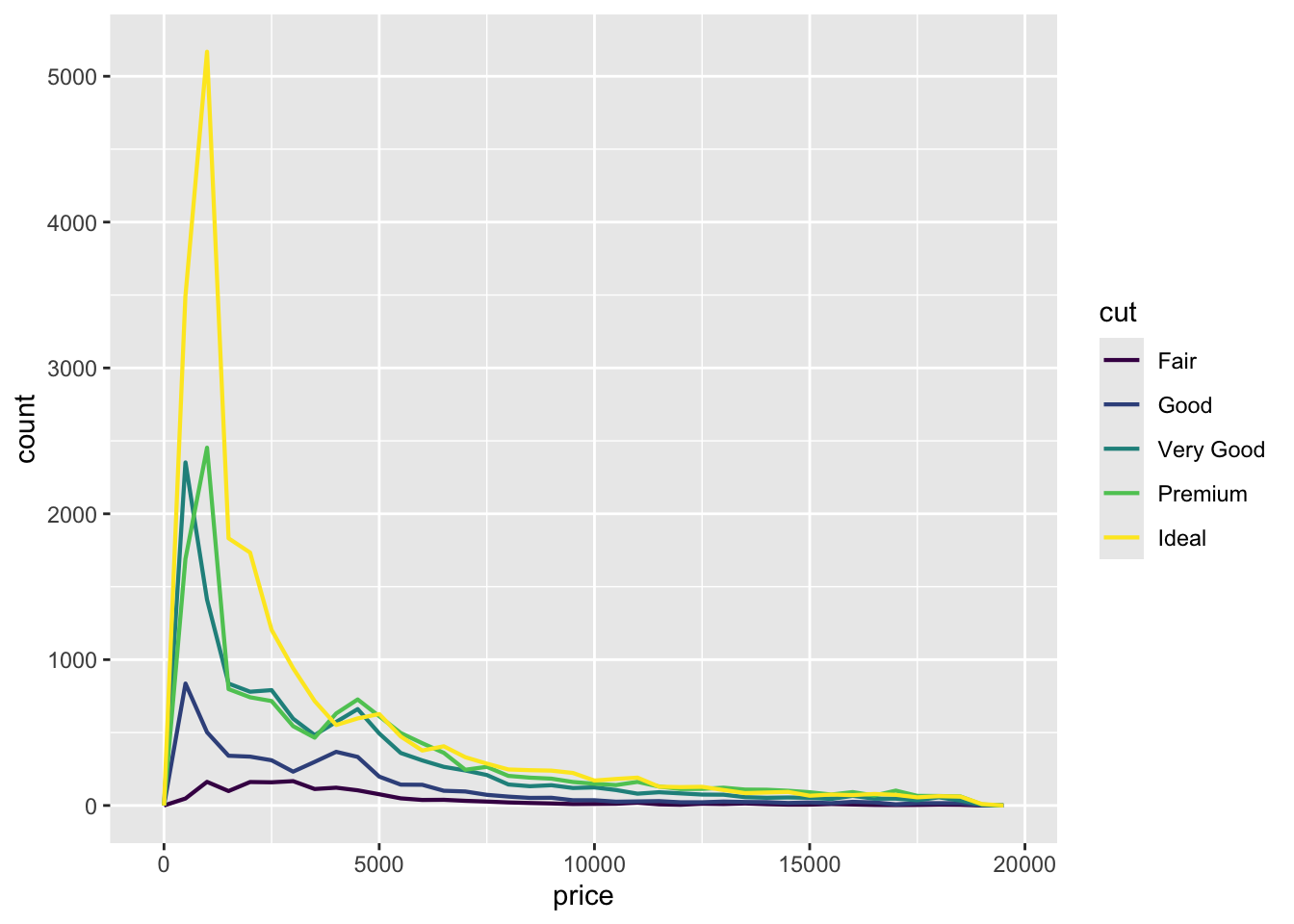
Note the nice (ordered) coloring - it’s due to the fact that cut is an ordered factor.
glimpse(diamonds)Rows: 53,940
Columns: 10
$ carat <dbl> 0.23, 0.21, 0.23, 0.29, 0.31, 0.24, 0.24, 0.26, 0.22, 0.23, 0.…
$ cut <ord> Ideal, Premium, Good, Premium, Good, Very Good, Very Good, Ver…
$ color <ord> E, E, E, I, J, J, I, H, E, H, J, J, F, J, E, E, I, J, J, J, I,…
$ clarity <ord> SI2, SI1, VS1, VS2, SI2, VVS2, VVS1, SI1, VS2, VS1, SI1, VS1, …
$ depth <dbl> 61.5, 59.8, 56.9, 62.4, 63.3, 62.8, 62.3, 61.9, 65.1, 59.4, 64…
$ table <dbl> 55, 61, 65, 58, 58, 57, 57, 55, 61, 61, 55, 56, 61, 54, 62, 58…
$ price <int> 326, 326, 327, 334, 335, 336, 336, 337, 337, 338, 339, 340, 34…
$ x <dbl> 3.95, 3.89, 4.05, 4.20, 4.34, 3.94, 3.95, 4.07, 3.87, 4.00, 4.…
$ y <dbl> 3.98, 3.84, 4.07, 4.23, 4.35, 3.96, 3.98, 4.11, 3.78, 4.05, 4.…
$ z <dbl> 2.43, 2.31, 2.31, 2.63, 2.75, 2.48, 2.47, 2.53, 2.49, 2.39, 2.…To determine co-variation we need to see the same pattern in multiple variables. But the differences in scale obscure this. The fix:
ggplot(diamonds, aes(x = price, y = after_stat(density))) +
  geom_freqpoly(aes(color = cut), binwidth = 500, linewidth = 0.75)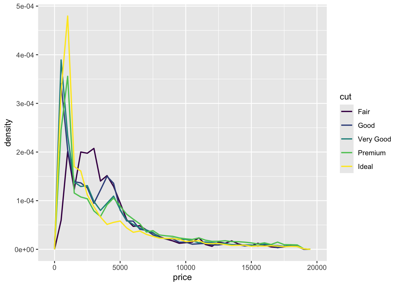
What are common traits of expensive diamonds? What about less expensive diamonds?
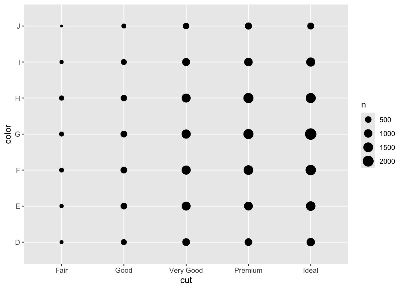
# expensive diamond distribution of color and cut
expensive <- diamonds |> filter(price > 2000)
expensive |> ggplot(aes(x=cut, y= color)) + geom_count()