library(tidyverse)
library(gapminder)
ggplot(gapminder,aes(x="year",y="pop")) + geom_point()
visualizing subsets of data
library(tidyverse)
library(gapminder)
ggplot(gapminder,aes(x="year",y="pop")) + geom_point()
%in% to see if the variable contains various countries of your choice.source("my_script.R",echo = TRUE)Below we make a subset of the data, whose country is China
C <- filter(gapminder,
       country == "China")
Do a ?filter to learn how else to modify the 2nd parameter using & , | and more.
Use a filter to reduce the size of the data and then label points on a scatterplot using geom_text_repel
library(ggrepel)
hi_pop_countries <- filter(gapminder,
                           pop > 500000000)
ggplot(hi_pop_countries,
       aes(x = year, y = gdpPercap)) +
       geom_point() +
       geom_text_repel(aes(label = country))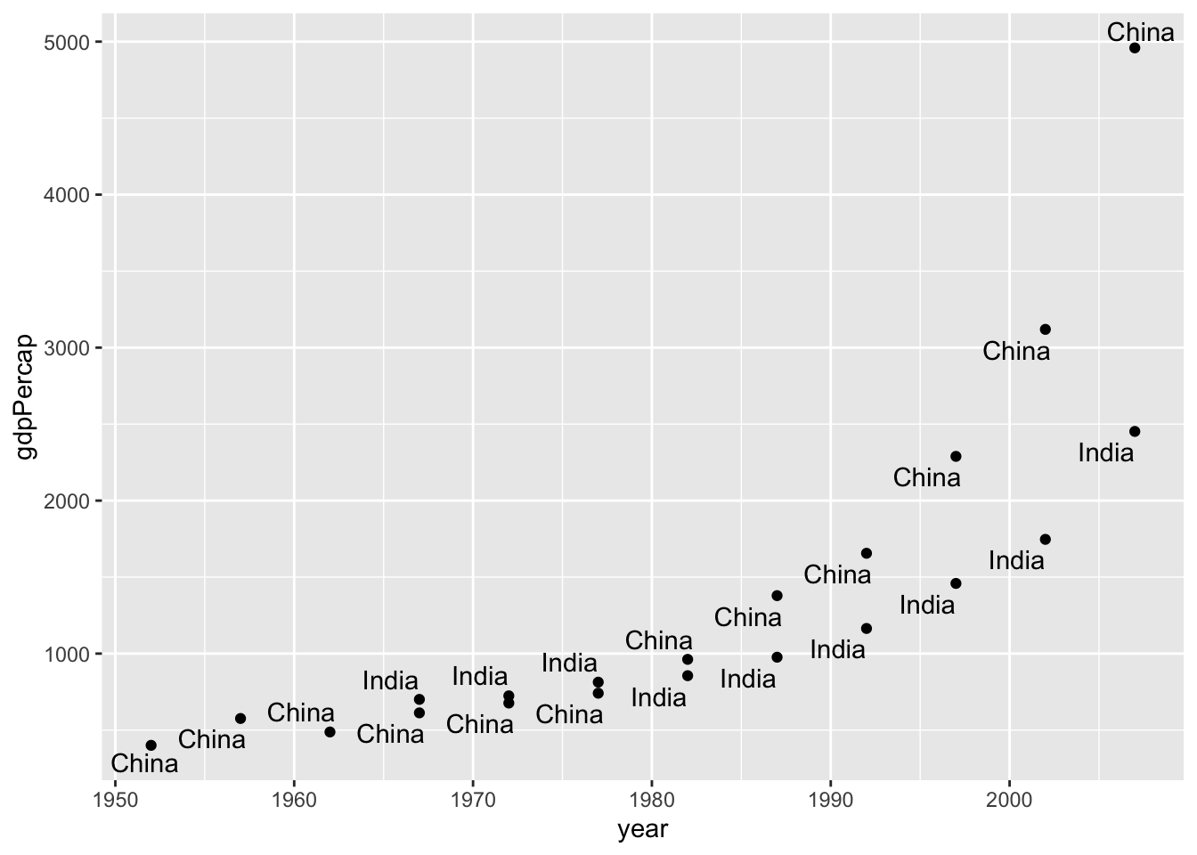
A boxplot is a visualization of the the distribution of a dataset via its five-number summary. 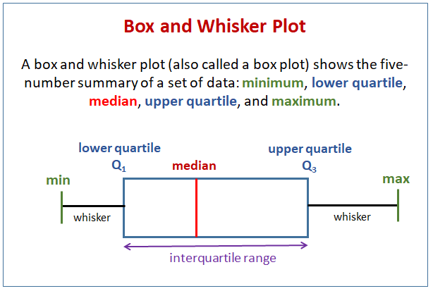
Here’s another filter and preview of boxplots & the reorder function.
hi_pop_countries <- filter(gapminder,
                           pop > 50000000)

ggplot(hi_pop_countries,
       aes(x = lifeExp, y = country)) + geom_boxplot()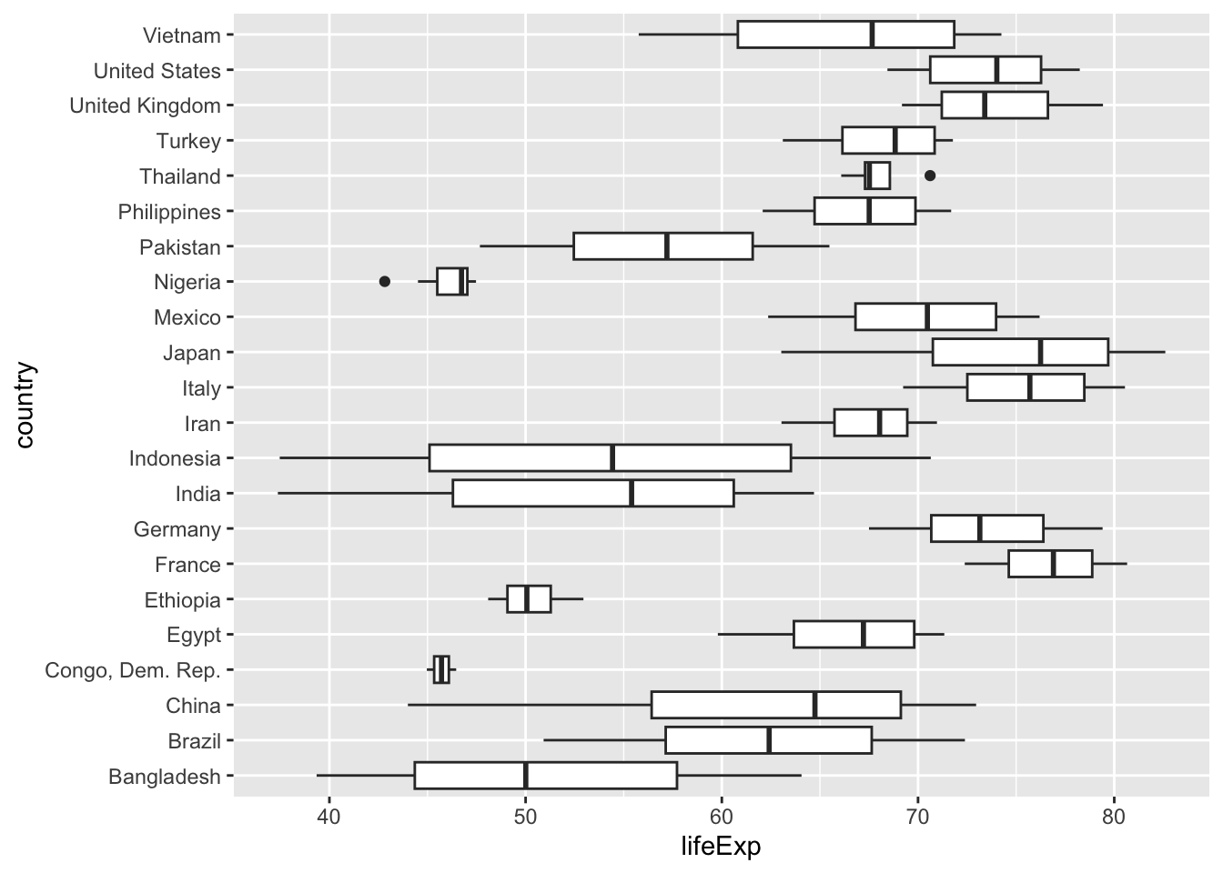
Isn’t this better? Use a plot & reorder for different variable.
ggplot(hi_pop_countries,
       aes(x = lifeExp, y = reorder(country,lifeExp))) +
    geom_boxplot()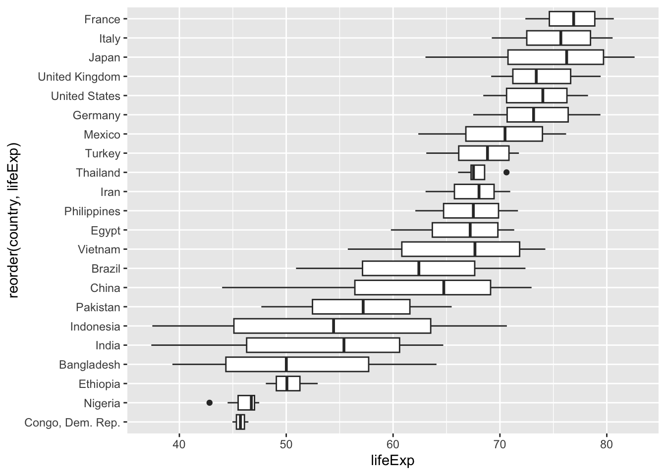
A histogram is another way to visualize the distribution of a dataset. A bin or range of values is chosen, visible as the width of the bars. The length of the (contiguous) bars reflects the frequency of the data within each bin.
TCU <- filter(gapminder,country %in% c("Taiwan","China","United States"))

TCU |> ggplot(aes(x = lifeExp, fill = country)) + geom_histogram(bins = 10)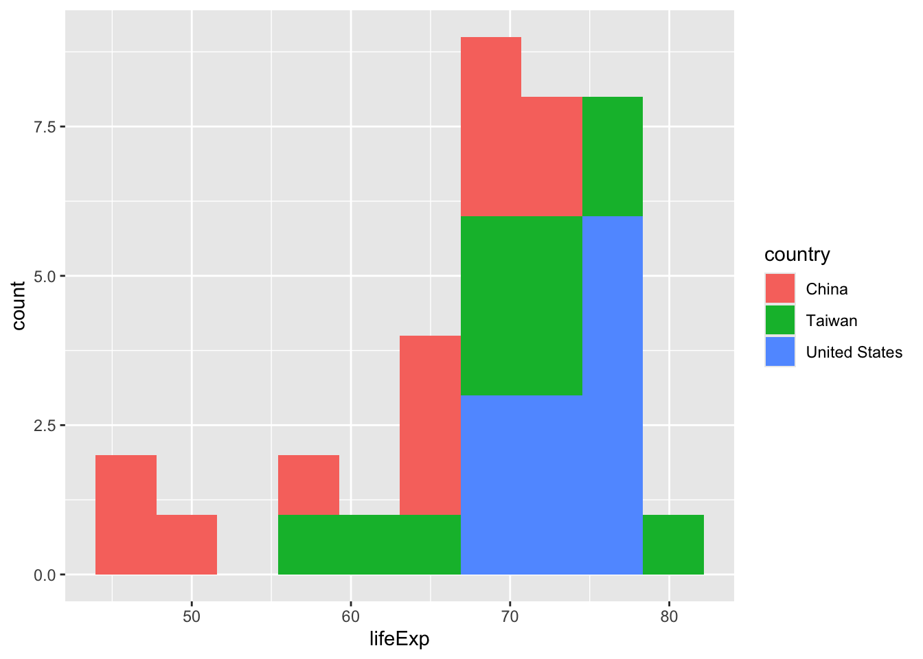
The data() command lists all dataset included with R and the Tidyverse. Note that the storms data is in dplyr.
Use filter and varioius geoms geom_point(), geom_histogram(), geom_boxplot(). to compare storms across time.
Complete these exercises. Use a quarto doc to generate an .html file. Copy the questions into your .qmd file and insert your responses after each one. Submit only the .html file.
Due: Midnight Thursday 9/4
Create three plots using filter and varioius geoms geom_point(), geom_histogram(), and geom_boxplot() to compare storms across time.