library(tidyverse)Matching Visualization to Data
Sections: 1.4-1.5: Tuesday, Week 2
Getting Started
Some reminders & preliminaries
Tidbits to be covered
- Dealing with x-axis labels that are too crowded. (
theme()andelement_text()orguides())
Load libraries
Save your work in scripts
In RStudio create new R-scripts with File > New File > R script. You can save R-commands and include documentation in a script. This is useful for class work and/or homework. You can also share scripts with others. Make sure that scripts work before you move on to other things.
We’ll use storms and gss_cat both included with the Tidyverse
Either view the data in the editor window or glimpse it in the console.
data()Here are 6 Ways to Visualize Data
Categorical Distributions
If you want to see how many samples there are in each category you can use a bar plot.
Create a bar plot with geom_bar(). Compare two categorical variables - one category is represented bar a bar and we fill each bar with another variable.
Use dataset gss_cat, A sample of categorical variables from the General Social survey.
glimpse(gss_cat)Rows: 21,483
Columns: 9
$ year <int> 2000, 2000, 2000, 2000, 2000, 2000, 2000, 2000, 2000, 2000, 20…
$ marital <fct> Never married, Divorced, Widowed, Never married, Divorced, Mar…
$ age <int> 26, 48, 67, 39, 25, 25, 36, 44, 44, 47, 53, 52, 52, 51, 52, 40…
$ race <fct> White, White, White, White, White, White, White, White, White,…
$ rincome <fct> $8000 to 9999, $8000 to 9999, Not applicable, Not applicable, …
$ partyid <fct> "Ind,near rep", "Not str republican", "Independent", "Ind,near…
$ relig <fct> Protestant, Protestant, Protestant, Orthodox-christian, None, …
$ denom <fct> "Southern baptist", "Baptist-dk which", "No denomination", "No…
$ tvhours <int> 12, NA, 2, 4, 1, NA, 3, NA, 0, 3, 2, NA, 1, NA, 1, 7, NA, 3, 3… ggplot(gss_cat, aes(x = race)) +
geom_bar(aes(fill = marital))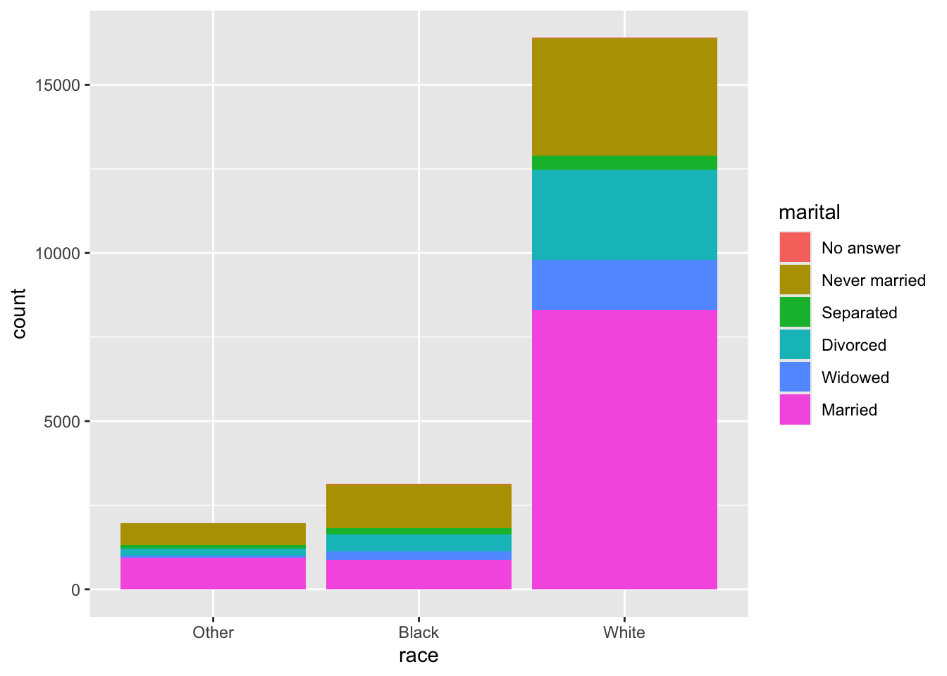
Numerical Distrubutions
If you want to see how many things there are having roughly the same numerical value using a histogram is useful. You can set binwidth to different values to reflect what roughly means. This would be good for test scores, etc.
Leave + signs at the end of the line, use indentation and alignment. Break you code into chunks, - start with the main 3 ingredients and build up slowly.
ggplot(storms, aes(x = lat)) +
  geom_histogram(binwidth =  .5, aes(fill = status)) +
  labs(x = "Latitude", y = "Number of storms",
       title = "Latitude Distribution",
       subtitle = "Half degree intervals")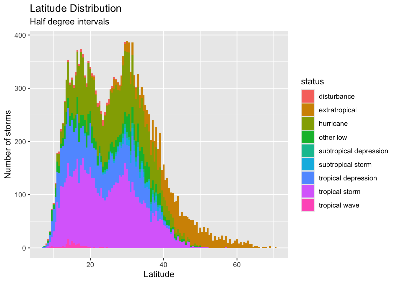
Relationships b/w a Numerical & Categorical Variable
In the storms data how do the latitudes (a numerical value) vary among the status categories?
Box plot
ggplot(storms, aes(x = status, y = lat)) +
  geom_boxplot() +
  theme(axis.text.x = element_text(angle = 60, hjust = 1 ))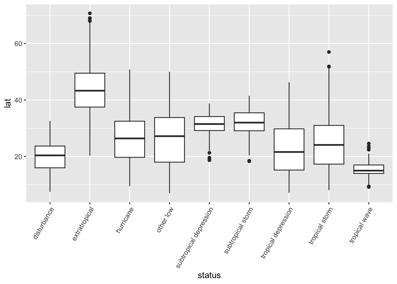
Another way to deal with crowded x-axis labels
ggplot(storms, aes(x = status, y = lat)) +
  geom_boxplot() +
  scale_x_discrete(guide = guide_axis(n.dodge = 2))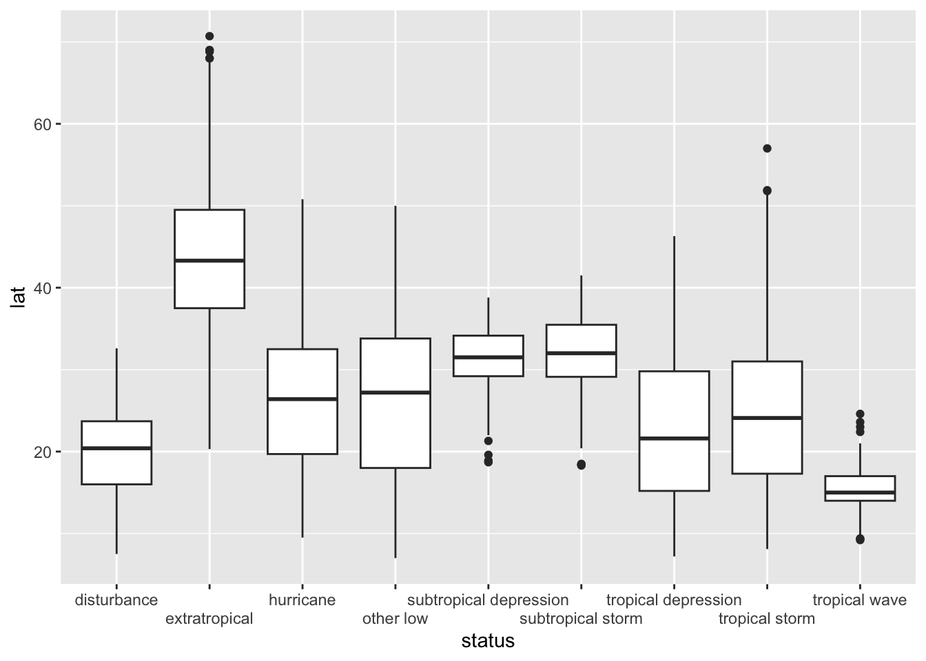
To explore these box plots, use filter to look at some actual data entries. How do the numbers in the data reflect what you see in the boxplot above?
Exercise Make the same histogram above, but with a subset of the data.
Vary binwidth and use scale_x_continuous to change the labels on the x-axis. Also, notice that we filled each bar with a fill = age aesthetic and we got capital Age in the legend in the labs() function.
hi_storms <- filter(storms, lat > median(lat))
ggplot(hi_storms, aes(x = lat)) +
  geom_histogram(binwidth =  .5, aes(fill = status)) +
  scale_x_continuous(breaks = seq(7,70,by = 0.5)) +
  labs(x = "Latitude", y = "Number of storms",
       title = "Latitude of Storms",
       fill = "Storm Type") +
  theme(axis.text.x = element_text(angle = 60, hjust = 1 ))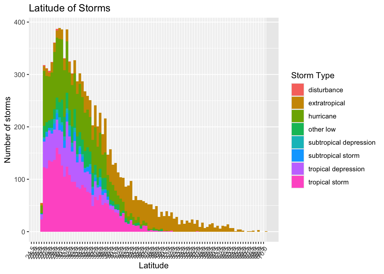
Exercise Improve the previous plot by changing the scale on the x-axis to improve readability.
Smooth Histograms
These are useful with large amounts of numerical data.
Use a density plot display a smooth histogram,
ggplot(storms, aes(x = lat,
  color = status, fill = status)) +
  geom_density(alpha = 0.5)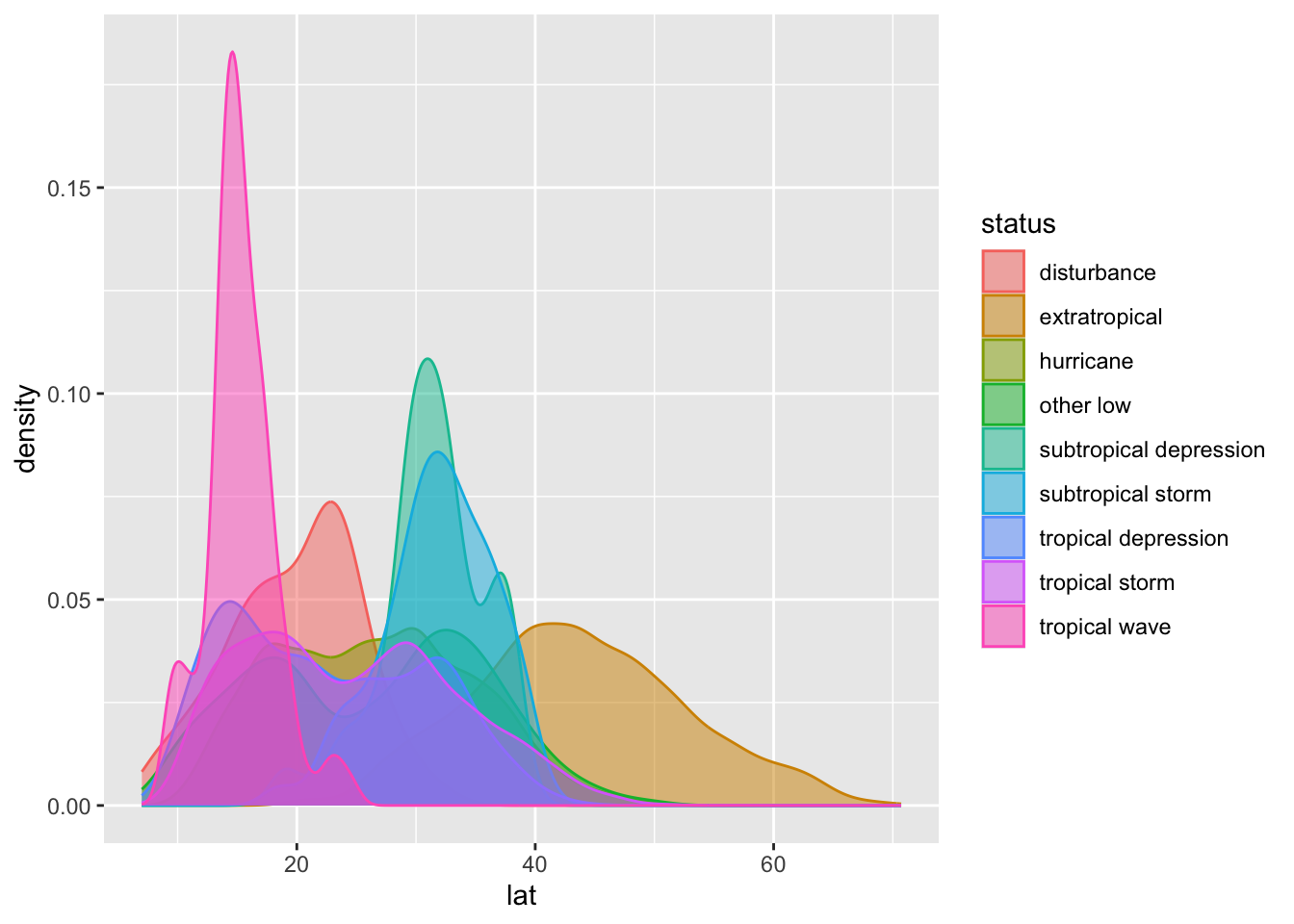
Another view of the data through a box plot. What conclusions can you draw about the differences between the kinds of storms from the data below?
ggplot(storms, aes(x = status, y = lat)) +
  geom_boxplot()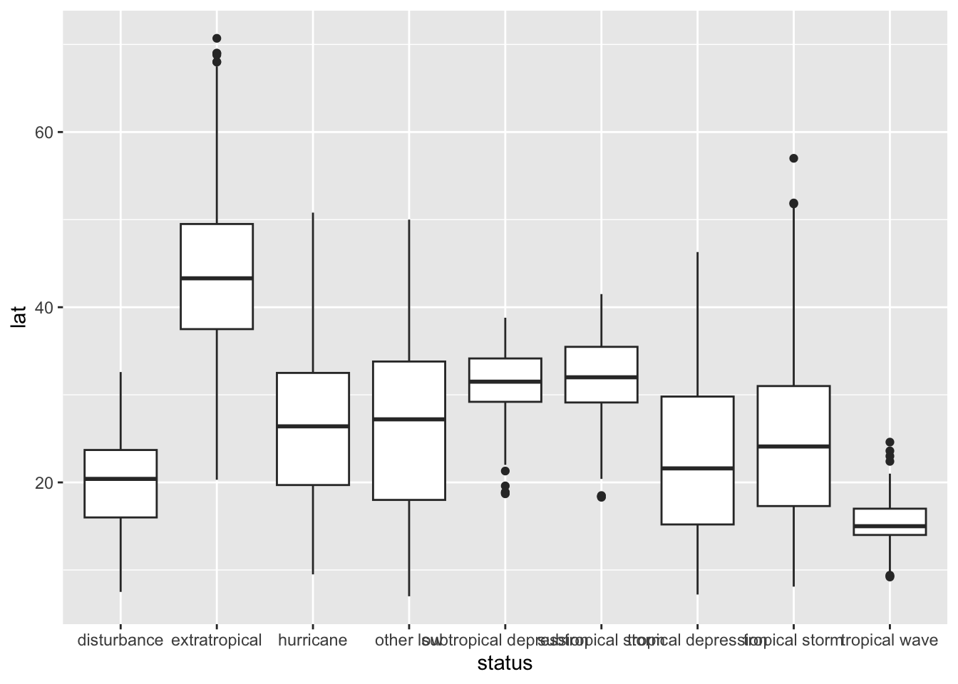
Three or more numerical values
It’s possible, but be careful not to over-do it. Too much information on a graphic is not good.
youth <- filter(gss_cat, age < 30)
ggplot(youth,
       aes(x = age, y = rincome)) +
       geom_point(aes(color = denom, shape = marital))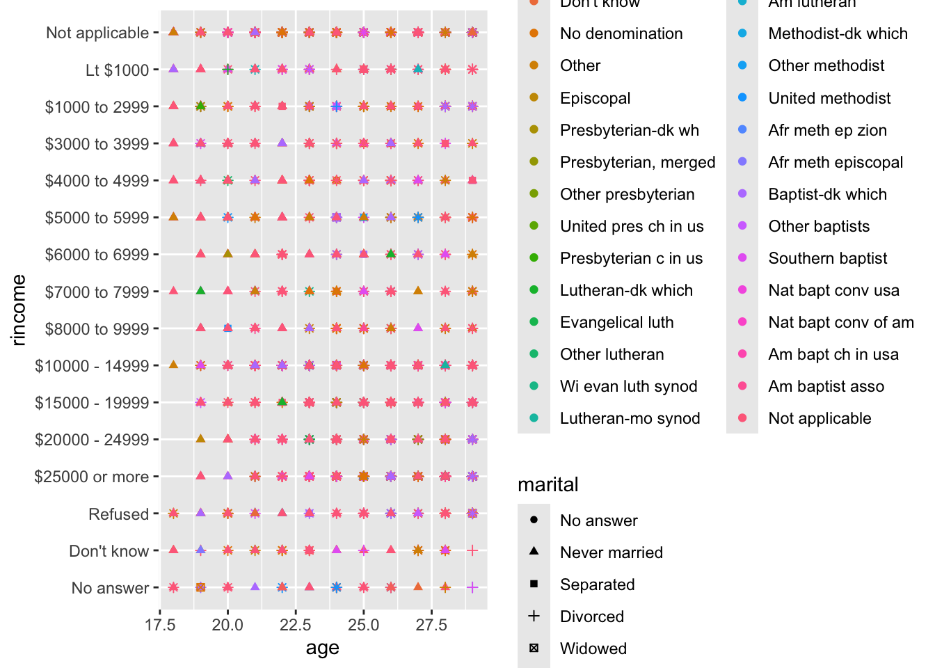
Assignment 4: Due in the Samba folder - Midnight, Tuesday 9/9
Answer all exercises in
https://r4ds.hadley.nz/data-visualize.html#exercises-2
and