#install.packages("ggstats")
library(ggstats)
library(tidyverse)Geoms & EDA w/Titanic Data
Statistical Transformations
These notes are based on the ggstat vignette.
stat_prop() is part of ggstat, an extension to ggplot2. It is a variation of stat_count() allowing to compute custom proportions according to the byaesthetic defining the denominator (i.e. all proportions for a same value of by will sum to 1). The by aesthetic should be a factor. Therefore, stat_prop() requires the by aesthetic and this by aesthetic should be a factor.
libraries & ggplot extensions
The Titanic dataset:
The Titanic dataset (in R’s datasets) is a 4-D array. Access it like this:
# Examine all the entries
Titanic[,,,]
, , Age = Child, Survived = No
Sex
Class Male Female
1st 0 0
2nd 0 0
3rd 35 17
Crew 0 0
, , Age = Adult, Survived = No
Sex
Class Male Female
1st 118 4
2nd 154 13
3rd 387 89
Crew 670 3
, , Age = Child, Survived = Yes
Sex
Class Male Female
1st 5 1
2nd 11 13
3rd 13 14
Crew 0 0
, , Age = Adult, Survived = Yes
Sex
Class Male Female
1st 57 140
2nd 14 80
3rd 75 76
Crew 192 20# The first-class data
Titanic[1,,,], , Survived = No
Age
Sex Child Adult
Male 0 118
Female 0 4
, , Survived = Yes
Age
Sex Child Adult
Male 5 57
Female 1 140# The 3rd-class data
Titanic[3,,,], , Survived = No
Age
Sex Child Adult
Male 35 387
Female 17 89
, , Survived = Yes
Age
Sex Child Adult
Male 13 75
Female 14 76# The Female 2nd-class data
Titanic[1,2,,] Survived
Age No Yes
Child 0 1
Adult 4 140To tidy this data we can use as.data.frame
d <- as.data.frame(Titanic)
glimpse(d)
Rows: 32
Columns: 5
$ Class <fct> 1st, 2nd, 3rd, Crew, 1st, 2nd, 3rd, Crew, 1st, 2nd, 3rd, Crew…
$ Sex <fct> Male, Male, Male, Male, Female, Female, Female, Female, Male,…
$ Age <fct> Child, Child, Child, Child, Child, Child, Child, Child, Adult…
$ Survived <fct> No, No, No, No, No, No, No, No, No, No, No, No, No, No, No, N…
$ Freq <dbl> 0, 0, 35, 0, 0, 0, 17, 0, 118, 154, 387, 670, 4, 13, 89, 3, 5…Count people on board by class and sex.
group_by(d,Class,Sex) |> summarize(n = sum(Freq))# A tibble: 8 × 3
# Groups: Class [4]
Class Sex n
<fct> <fct> <dbl>
1 1st Male 180
2 1st Female 145
3 2nd Male 179
4 2nd Female 106
5 3rd Male 510
6 3rd Female 196
7 Crew Male 862
8 Crew Female 23In the following example, we:
- use
stat = "prop"to tellgeom_text()to usestat_prop() - used the
position_stackin to place text atop its stack
p <- ggplot(d) +
  # what happens when you remove "weight = Freq"?
  aes(x = Class, fill = Survived, weight = Freq) +
  geom_bar() +
  # halfway up the stack
  geom_text(stat = "prop", position = position_stack(.5)) +
  labs(title = "Both Counts & Percentages", y = "Total")

print(p)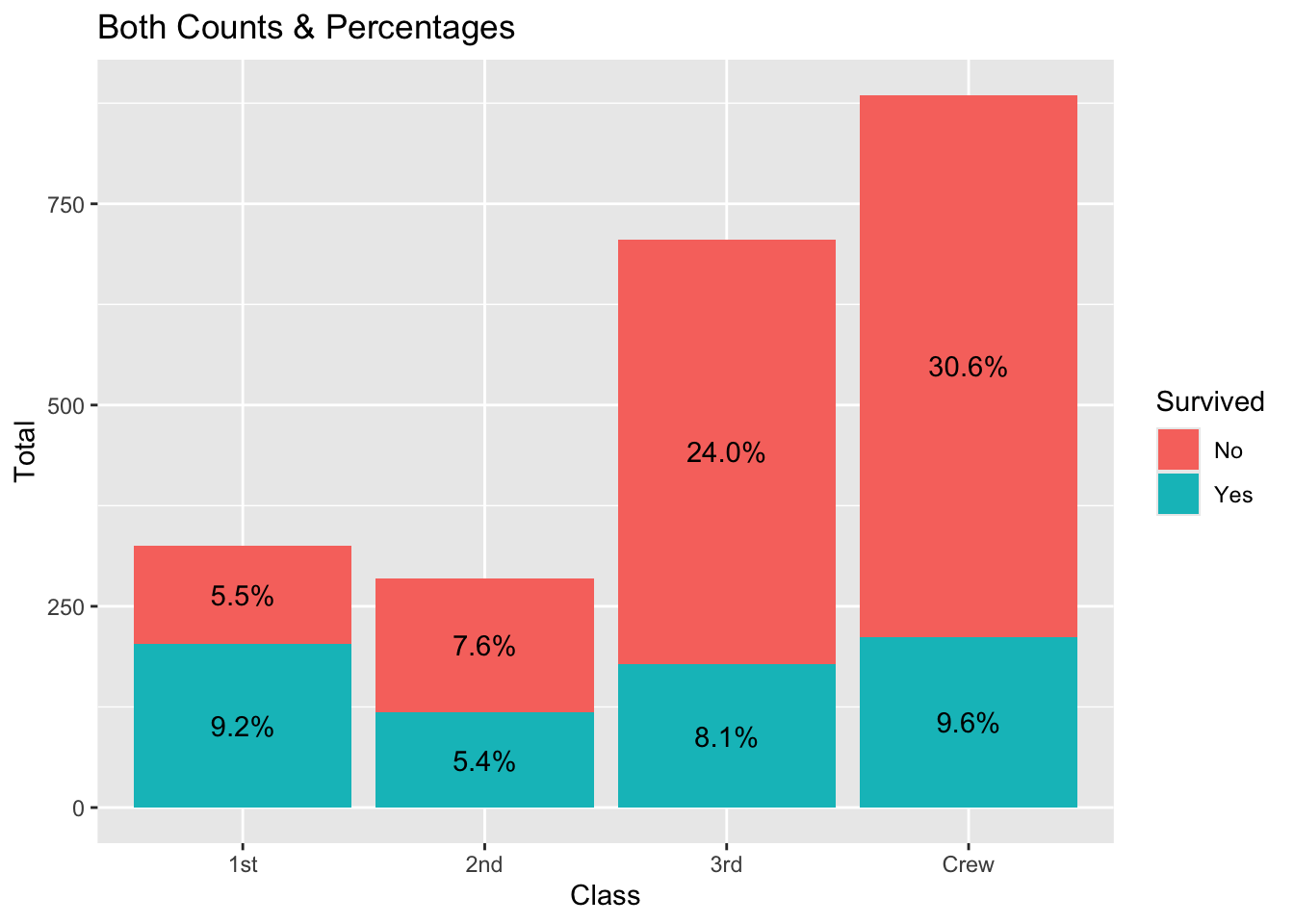
In the following example, we:
use
stat = "prop"tell`geom_text()to usestat_prop()defined the by aesthetic (here we want to compute the proportions separately for each value of Class)
used
position_fill()when callinggeom_text()to match the position = “fill” in geom_bar() and place text at the 0.5 (halfway) mark of each bar
p <- ggplot(d) +
  aes(x = Class, fill = Survived, weight = Freq, by = Class) +
  geom_bar(position = "fill") +
  geom_text(stat = "prop", position = position_fill(0.5)) +
  labs(title = "Proportions & Percentages", y = "Percent")

print(p)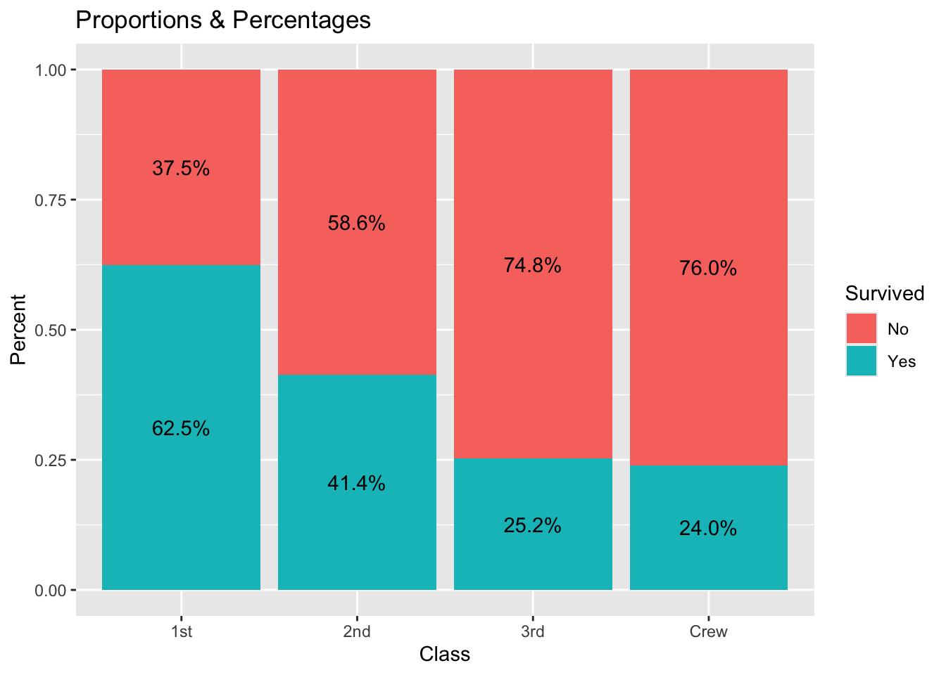
Facet over Gender.
p + facet_grid(~Sex) 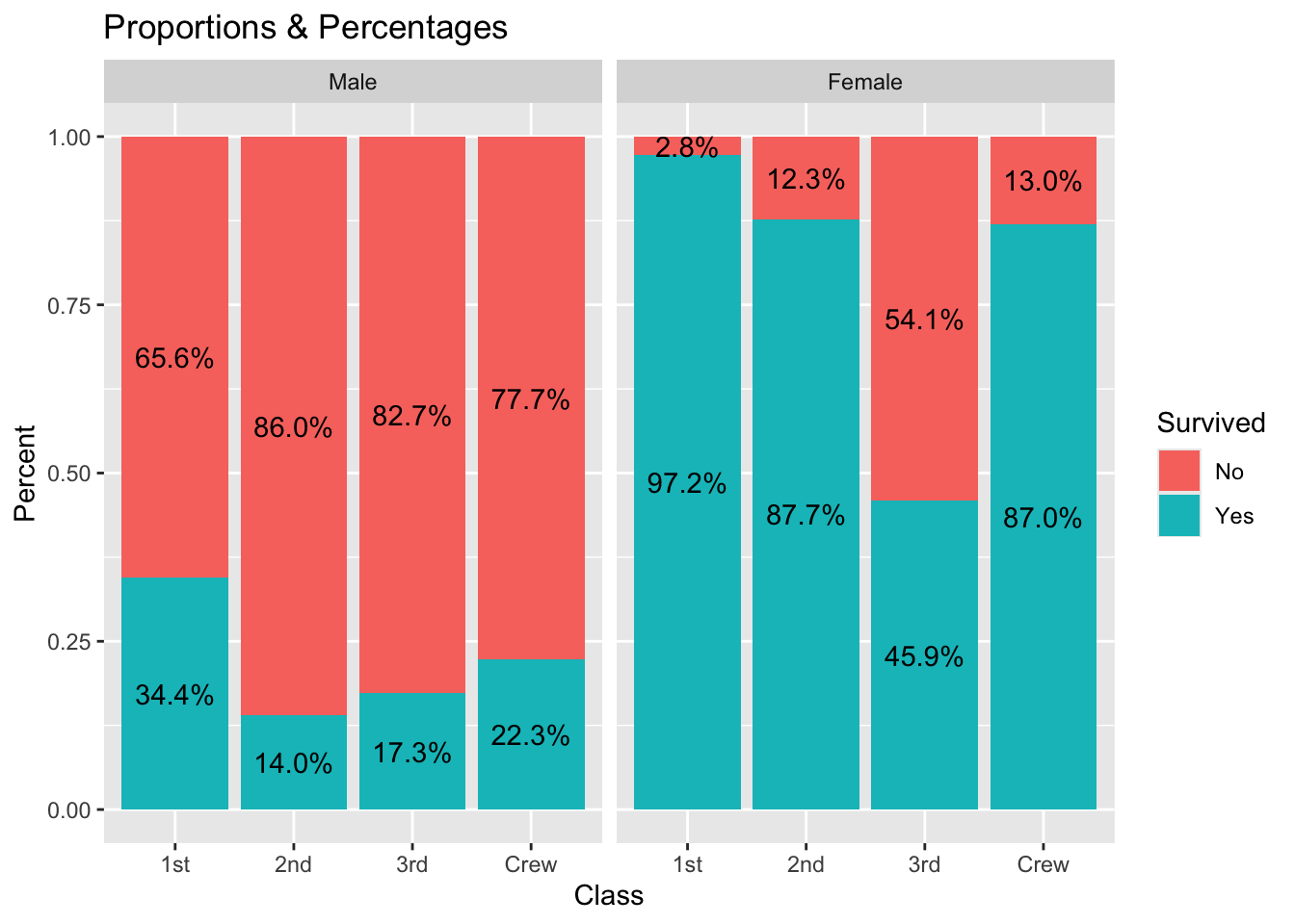
Displaying proportions of the total
If you want to display proportions of the total, simply map the by aesthetic to 1. Here an example using a stacked bar chart.
ggplot(d) +
  aes(x = Class, fill = Survived, weight = Freq, by = 1) +
  geom_bar() +
  geom_text(
    aes(label = scales::percent(after_stat(prop), accuracy = 1)),
    stat = "prop",
    position = position_stack(.5)) +
  labs(title = "Percentages of total")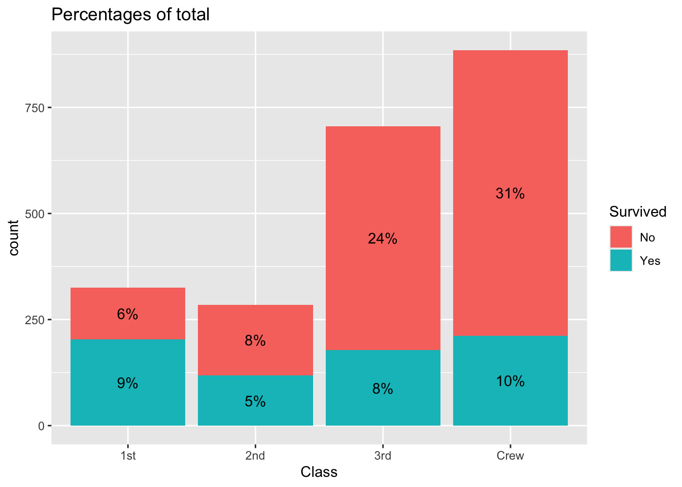
A dodged bar plot to compare two distributions
A dodged bar plot could be used to compare two distributions.
ggplot(d) +
  aes(x = Class, fill = Sex, weight = Freq, by = Sex) +
  geom_bar(position = "dodge")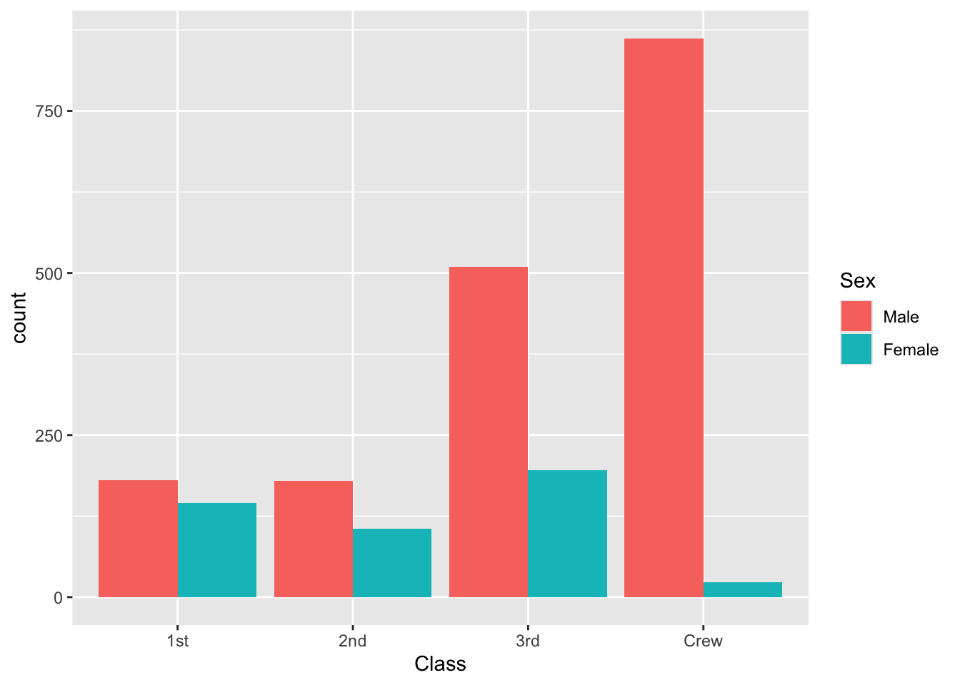
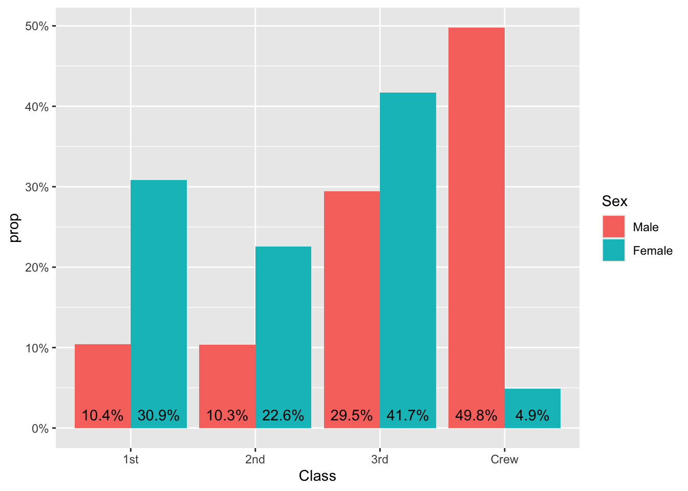
Above, we see more men than women in each category. Thus, it is difficult to see if first class is over- or under-represented among women, due to the fact they were muany more men on the boat. stat_prop() could be used to adjust the graph by displaying instead the proportion within each category (i.e. here the proportion by sex).
That is, we see that half the men on-board were crew, and roughly 40% of the women had 3rd class tickets.
ggplot(d) +
  aes(x = Class, fill = Sex, weight = Freq, by = Sex, y = after_stat(prop)) +
  geom_bar(stat = "prop", position = "dodge") +
  scale_y_continuous(labels = scales::percent)
Finally, the same plot with labels
ggplot(d) +
  aes(x = Class, fill = Sex, weight = Freq, by = Sex, y = after_stat(prop)) +
  geom_bar(stat = "prop", position = "dodge") +
  scale_y_continuous(labels = scales::percent) +
  geom_text(
    aes(
      label = scales::percent(after_stat(prop), accuracy = .1),
      y = after_stat(0.01)),
    vjust = "bottom",
    # what does the .9 do?
    position = position_dodge(.9),
    stat = "prop"
  )
For more see the geom_text vignette.
Alternative: circles instead of bar plots & choosing colors
# compute the percentages yourself, instead of having the geom_ do it
ds <- group_by(d,Class,Survived) |>
summarize(Total = sum(Freq),
.groups = "drop") |>
# what happens when you remove .groups = "drop"
mutate(n = sum(Total),
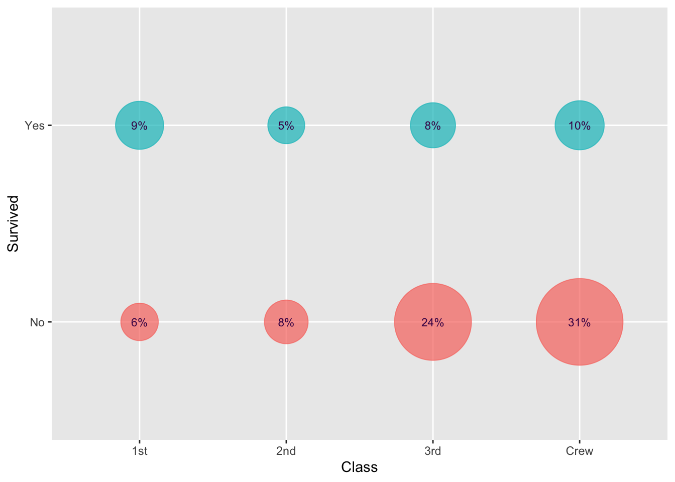
Percent = 100*round(Total/n,2))As a first pass, suppose you create the below. Improve it.
ggplot(ds,aes(x=Class,y=Survived,size=Total, color=Survived)) +
  geom_point() +
  geom_text(aes(label = Percent))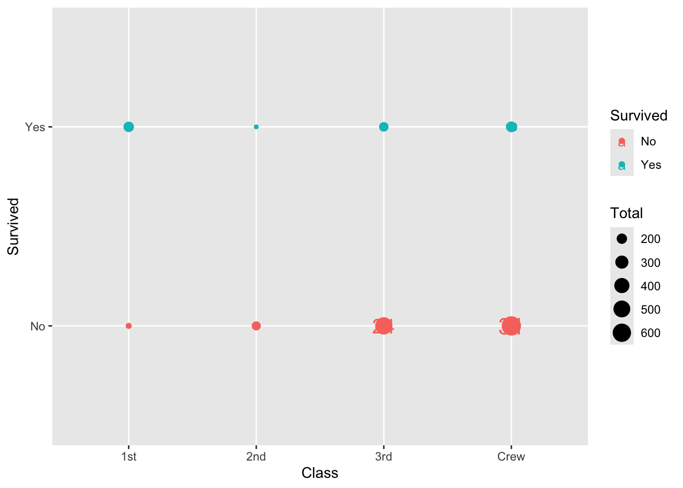
Ways to improve
- Why is the color of the label the same as the point?
- How to enlarge the size of the points?
- How to change the color of the points?
- How to remove the legend?
One manual way to control colors is first obtain a color palette. The package viridis contains palettes that make plots that are pretty, better represent your data, easier to read by those with colorblindness, and print well in gray scale.
# Grab 3 colors (spaced out by default) from the viridis palette.
pal <- scales::viridis_pal()(n=3)

# mapping to levels isn't necessary, but it might help in more complicated scenarios
my_colors <- c(
  "Level1" = pal[1],
  "Level2" = pal[2],
  "Level3" = pal[3]
)ggplot(ds,aes(x=Class,y=Survived,size=Total)) +
geom_point(aes(color=Survived),alpha=.7) + scale_size_area(max_size = 30) +
geom_text(aes(label = paste0(Percent,"%")),
size = 3, color = pal[1]) +
scale_fill_manual(values = pal[2:3]) +
theme(legend.position = "none")