library(tidyverse)
# install gifski and av
# install.packages("gifski")
# install.packages("av")
# install.packages("gganimate")
library(gganimate)Simple Animated Plots
Visual Global Climate Events & Economic Impact with Animations
As usual, we’ll use the tidyverse but also some new packages that you will have to install. Uncomment the lines below if you don’t already have them installed.
Load this data from Kaggle. From the website -
This comprehensive dataset tracks major climate events worldwide and their economic impact from 2020 to September 2025. With over 3,000 documented events across 51 countries, this dataset provides crucial insights into the increasing frequency and severity of climate-related disasters and their economic consequences.
gce <-read_csv("https://euclid.nmu.edu/~joshthom/teaching/dat309/week6/global_climate_events_economic_impact_2020_2025.csv")

glimpse(gce)
Rows: 3,000
Columns: 20
$ event_id <chr> "EV01539", "EV02303", "EV01796", "EV0017…
$ date <date> 2020-01-01, 2020-01-01, 2020-01-02, 202…
$ year <dbl> 2020, 2020, 2020, 2020, 2020, 2020, 2020…
$ month <dbl> 1, 1, 1, 1, 1, 1, 1, 1, 1, 1, 1, 1, 1, 1…
$ country <chr> "Japan", "Qatar", "Canada", "Poland", "U…
$ event_type <chr> "Tsunami", "Hurricane", "Drought", "Heat…
$ severity <dbl> 1, 1, 3, 6, 4, 3, 3, 4, 1, 4, 1, 4, 5, 6…
$ duration_days <dbl> 1, 4, 6, 16, 16, 72, 2, 1, 1, 1, 7, 1, 5…
$ affected_population <dbl> 420956, 3276, 120382, 185527, 176642, 24…
$ deaths <dbl> 0, 1, 0, 2, 2, 1, 0, 1, 0, 3, 0, 0, 2, 1…
$ injuries <dbl> 2, 10, 9, 37, 27, 15, 14, 19, 7, 30, 4, …
$ economic_impact_million_usd <dbl> 0.01, 0.00, 0.10, 1.27, 2.01, 0.63, 0.77…
$ infrastructure_damage_score <dbl> 4.9, 3.4, 8.9, 17.8, 18.7, 5.4, 12.3, 11…
$ response_time_hours <dbl> 11, 5, 10, 7, 17, 2, 8, 8, 30, 5, 6, 8, …
$ international_aid_million_usd <dbl> 0, 0, 0, 0, 0, 0, 0, 0, 0, 0, 0, 0, 0, 0…
$ latitude <dbl> 85.4321, -32.0370, 78.4213, 73.6564, 52.…
$ longitude <dbl> 138.7206, 14.0111, -112.7556, 115.0650, …
$ total_casualties <dbl> 2, 11, 9, 39, 29, 16, 14, 20, 7, 33, 4, …
$ impact_per_capita <dbl> 0.02, 0.00, 0.83, 6.85, 11.38, 2.56, 0.1…
$ aid_percentage <dbl> 0, 0, 0, 0, 0, 0, 0, 0, 0, 0, 0, 0, 0, 0…An initial barplot
ggplot(gce, aes(y = country, fill = country)) +
  geom_bar() +
  theme(legend.position = "none")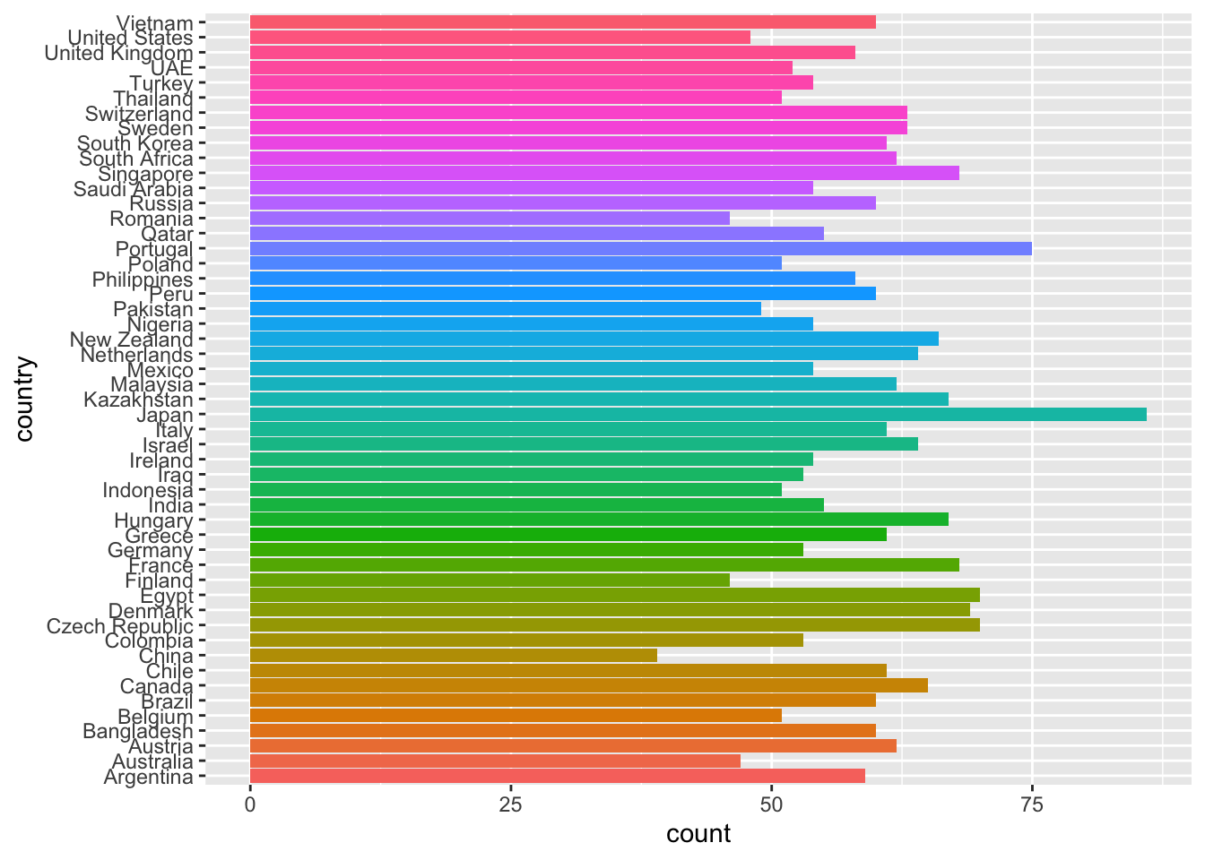
Reorder to improve the readability w/ lollipop plot
Read here for more.
events_per_country <- count(gce,country) |>
  mutate(country = reorder(country,n))

events_per_country |>
  ggplot(aes(y = country, x = n)) +
  geom_segment(aes(x=0, xend=n, y=country, yend=country)) +
  geom_point(aes(color=country)) +
  theme_minimal() +
  theme(legend.position = "none")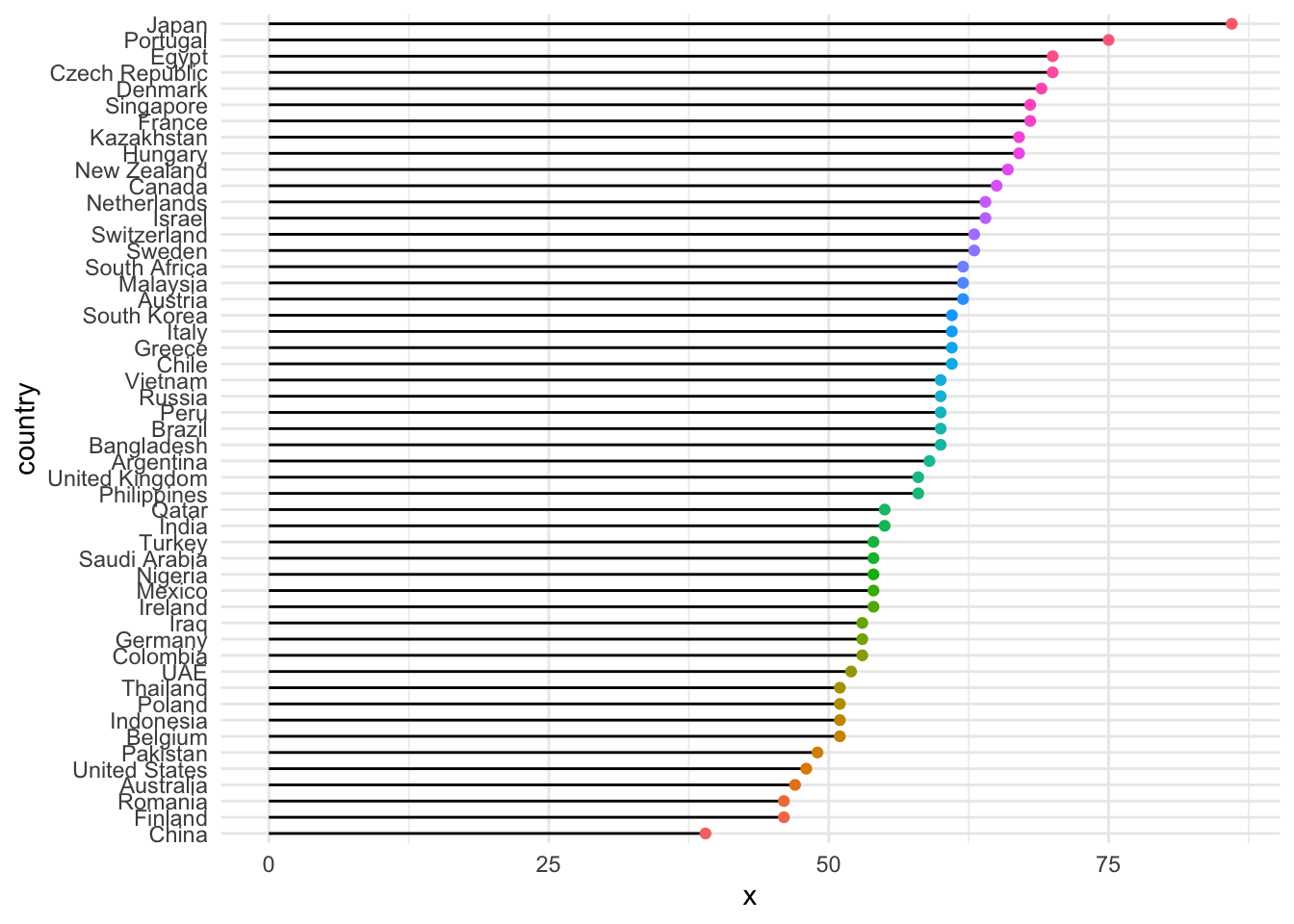
Repeat the plot but for just one year
events_per_country <- filter(gce,year == 2020) |>
  count(country) |>
  mutate(country = reorder(country,n))

events_per_country |>
  ggplot(aes(y = country, x = n)) +
  geom_segment(aes(x=0, xend=n, y=country, yend=country)) +
  geom_point(aes(color=country)) +
  theme_minimal() +
  theme(legend.position = "none")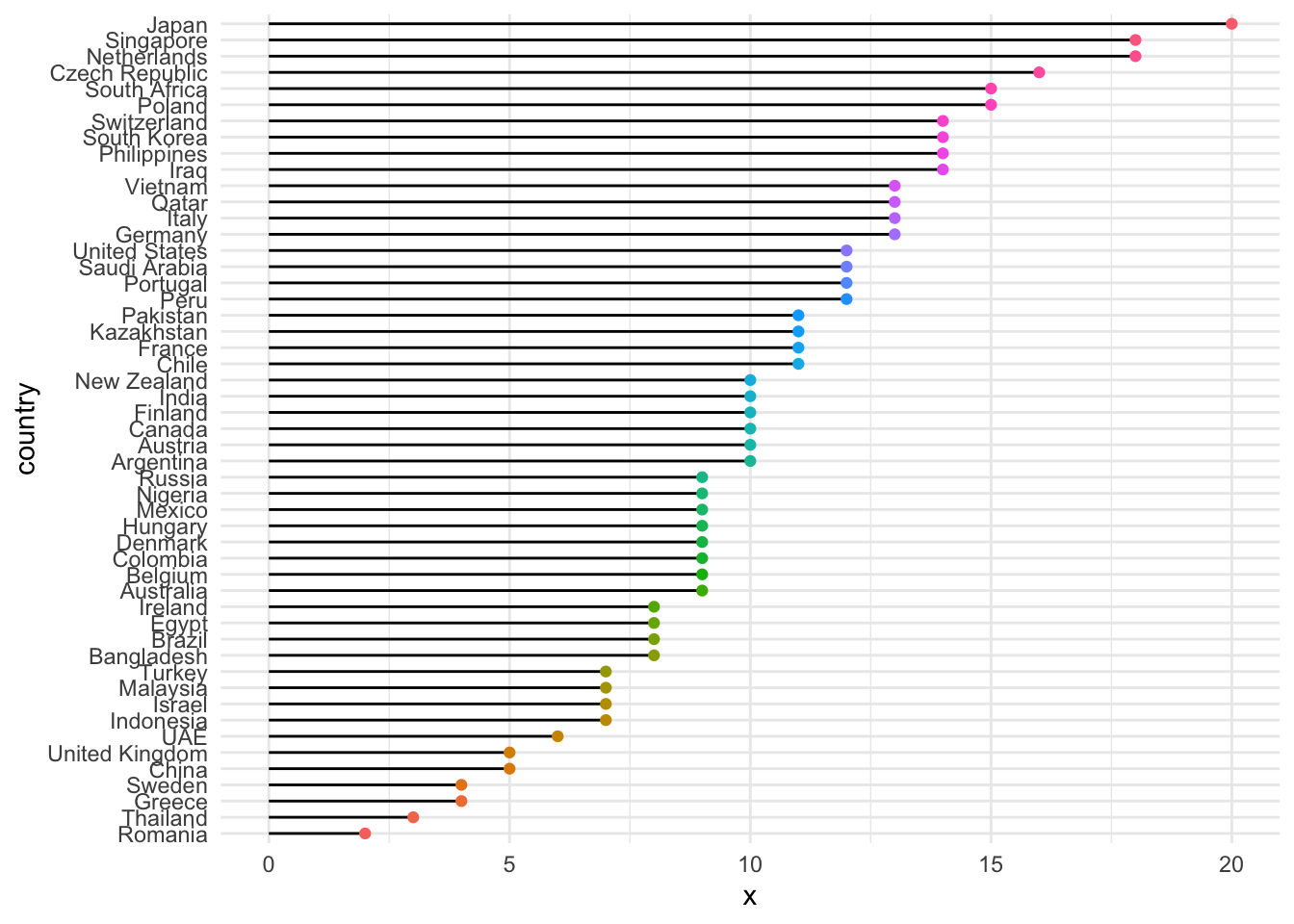
Animate over a variable
# count below is equivalent to: group_by() |> summarize(n=n())
events_per_country <- count(gce,country,year) |>
  mutate(country = reorder(country,n))

events_per_country |>
  ggplot(aes(y = country, x = n)) +
  geom_segment(aes(x=0, xend=n, y=country, yend=country)) +
  geom_point(aes(color=country)) +
  theme_minimal() +
  theme(legend.position = "none") +
  # the animation steps
  transition_states(states=year, # year is a variable in data
                    transition_length = 1,
                    state_length = 10) +
  enter_fade() +
  exit_fade() +
  ease_aes('linear') +
  labs(title = "Year: {closest_state}",
       y = "Country", x = "Number of Events")

last_animation() # display the animation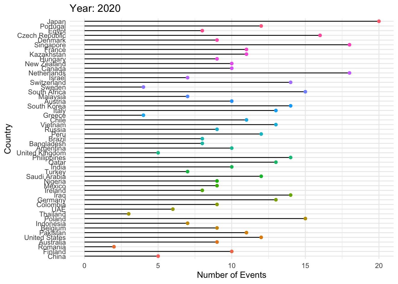
Exercise
- Produce a similar animation, but animate over the economic impact, affected population or other variable.
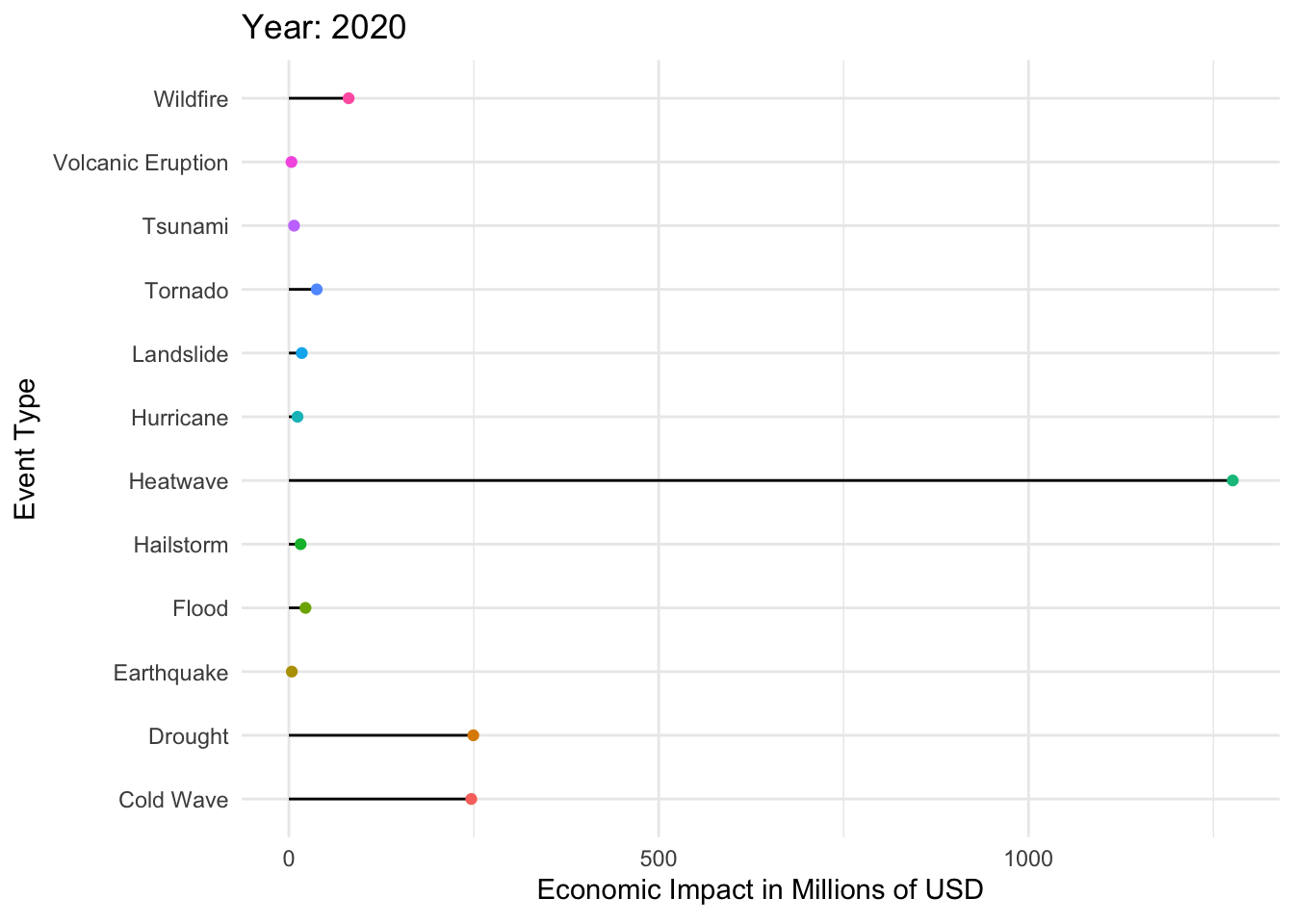
economic_impact_per_event <- group_by(gce,event_type,year) |>
  summarize(
    econ = sum(economic_impact_million_usd)) |>
    mutate(event_type = reorder(event_type,econ))
p <- economic_impact_per_event |>
ggplot(aes(y = event_type, x = econ)) +
geom_segment(aes(x=0, xend=econ, y=event_type, yend=event_type)) +
geom_point(aes(color=event_type)) +
theme_minimal() +
theme(legend.position = "none") +
# the animation steps
transition_states(states=year, # year is a variable in data
) +
# transition_length = 1,
# state_length = 10) +
enter_fade() +
exit_fade() +
ease_aes('linear') +
labs(title = "Year: {closest_state}",
y = "Event Type", x = "Economic Impact in Millions of USD")
animate(p,
duration = 10, # 41 countries, 2 seconds each
fps = 5,
#nframes = [...or pick it here])
)
Using plotly to animate
dataset CO2
In R’s datasets:
Atmospheric concentrations of CO2are expressed in parts per million (ppm) and reported in the preliminary 1997 SIO manometric mole fraction scale.
a <- datasets::co2

# before you move on notice the structure of the data in a, it's not tidyverse friendly

# tidy the data
co2_tib <- data.frame(matrix(co2, ncol = 12, byrow = TRUE)) %>%
  setNames(c('Jan','Feb','Mar','Apr','May','Jun','Jul','Aug',
             'Sep','Oct','Nov','Dec')) %>%
  mutate(year = as.character(1959:1997))

# pivot to make plotting easy
co2_long <- co2_tib |> pivot_longer(cols = !year, names_to ="month", values_to="level")
Use plotly
library(plotly)

fig <- co2_long %>%
  plot_ly(
    x = ~month,
    y = ~level,
    frame = ~year,
    type = 'scatter',
    mode = 'markers',
    showlegend = F,
    size = 10
  ) |>
  layout(title = "Atmospheric Concentration of CO2")

fig
Other forms of Interactivity
    library(plotly)

    p <- gce %>%
    ggplot( aes(
      x = affected_population,
      y = total_casualties,
      size = infrastructure_damage_score,
      color=event_type)) +
      scale_x_continuous(trans = "log") +
    geom_point() +
    theme_bw()

    ggplotly(p)
You can:
Zoom by selecting an area of interest
Hover the line to get exact time and value
Export to png
Slide axis
Double click to re-initialize.
3-D Plots
The package rgl is great for 3D plots. It creates a stand-alone window of your 3d plot.
# install.packages("rgl")
library(rgl)
# Data: the iris data is provided by R
data <- iris

# Add a new column with color
mycolors <- c('royalblue1', 'darkcyan', 'oldlace')
data <- mutate(data,color = mycolors[ as.numeric(Species) ])

# Plot
plot3d(
  x=data$`Sepal.Length`, y=data$`Sepal.Width`, z=data$`Petal.Length`,
  col = data$color,
  type = 's',
  radius = .1,
  xlab="Sepal Length", ylab="Sepal Width", zlab="Petal Length")
To display it in a Quarto/R Markdown document:
# To display in an R Markdown document:
rglwidget()
Exercise
Repeat the 3d plot above on the penguins data, or the gce data.