# install.packages("maps")
# install.packages("countrycode")
library(countrycode)
library(dplyr)
library(stringr)
library(ggplot2)
library(maps)Making Maps
Note: This is based off Sarah’s Notes
Making Maps in R
Let’s plot the global human development index (HDI). The HDI metric from the United Nations Development Program (UNDP) is a summary measure of the average achievement of a country in key dimensions of human development: a long and healthy life, being knowledgeable, and a decent standard of living (value ranges from 0 to 1, higher = better).
Load Libraries
The maps package contains outlines of several continents, countries, and states (examples: world, usa, state) that have been with R for a long time. maps has its own plotting function, but we will use the map_data() function of ggplot2 to make a data frame that ggplot2 can operate on.
Create a data frame from map outlines
world <- map_data("world")The new world data frame has the following variables: long for longitude, lat for latitude, group tells which adjacent points to connect, order refers to the sequence by which the points should be connected, and region and subregion annotate the area surrounded by a set of points.
Make a simple world map
geom_polygon() draws maps with gray fill by default and coord_fixed() specifies the aspect ratio of the plot (every y unit is 1.3 times longer than the x unit).
world <- map_data("world")
worldplot <- ggplot() +
  geom_polygon(data = world, aes(x=long, y = lat, group = group)) +
  coord_fixed(1.3)
worldplot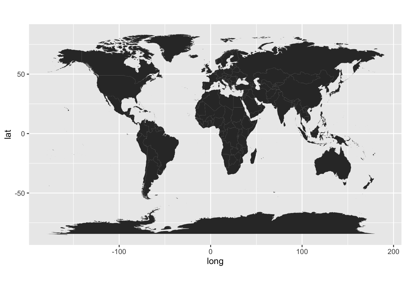
Prepare to merge data
library(tidyverse)
# add variable in world data that is commonly used for merging
world <- world |> mutate(cname = countrycode(
  region,
  origin = 'country.name.en',
  destination = 'genc3c'))
gce <- read_csv("http://euclid.nmu.edu/~joshthom/teaching/dat309/week6/global_climate_events_economic_impact_2020_2025.csv")
gce <- gce |> mutate(cname = countrycode(
country,
origin = 'country.name.en',
destination = 'genc3c'))Summarize some data for each year & country.
First observe that some countries had multiple events with roughly the same economic impact.
gce |> count(country,year,economic_impact_million_usd)# A tibble: 2,496 × 4
country year economic_impact_million_usd n
<chr> <dbl> <dbl> <int>
1 Argentina 2020 0 2
2 Argentina 2020 0.01 1
3 Argentina 2020 0.02 3
4 Argentina 2020 0.12 1
5 Argentina 2020 0.18 1
6 Argentina 2020 0.68 1
7 Argentina 2020 3.84 1
8 Argentina 2021 0.01 2
9 Argentina 2021 0.05 1
10 Argentina 2021 0.07 1
# ℹ 2,486 more rowsSo just add up by year:
gce_econ <- gce |> group_by(country,year) |>
  summarize(econ_impact = sum(economic_impact_million_usd))
Rejoin data
First transform the country variable into a code, compatible with the code in the other data frame.
library(countrycode)
gce_econ <- gce_econ |> mutate(cname = countrycode(
  country,
  origin = 'country.name.en',
  destination = 'genc3c'))

world_gce <- left_join(gce_econ, world,by="cname")
final plotting
gce_plot <- ggplot(
  data = world_gce,
  mapping = aes(x = long, y = lat, group = group)) +
  geom_polygon(aes(fill = econ_impact)) +
  coord_fixed(1.3) +
  # automatically map to ColorBrewer palette
  scale_fill_distiller(type = 'seq', palette = 'BuGn', direction = -1) + # or direction=1
  ggtitle("Global Events") +
  theme_minimal()

gce_plot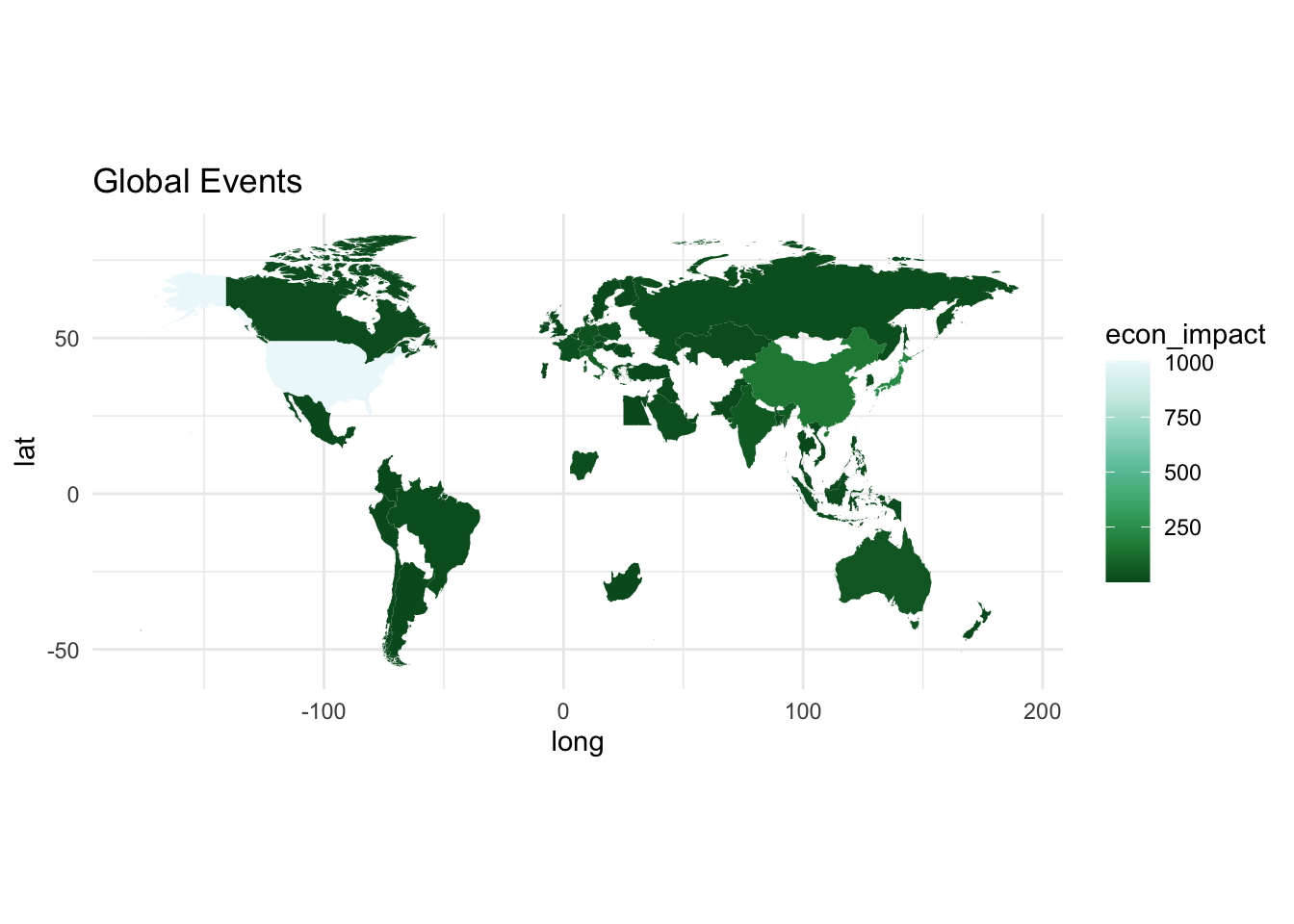
Not bad, but we can improve
Filter by some fixed date. Group by month, country and compute a statistic on severity.
gce_sev <- gce |> group_by(month,cname) |>
  summarize(max_sev = max(severity,na.rm =TRUE))

world_sev <- left_join(gce_sev, world, by ="cname")
gce_plot <- ggplot(
data = world_sev,
mapping = aes(x = long, y = lat, group = group)) +
geom_polygon(aes(fill = as.factor(max_sev))) +
coord_fixed(1.3) +
# automatically map to ColorBrewer palette
#scale_fill_distiller(type = 'qual', palette = 'BuGn', direction = -1) + # or direction=1
scale_fill_discrete(type = 'qual', palette = 'BuGn', direction = -1) + # or direction=1
ggtitle("Global Events") +
theme_minimal()
gce_plot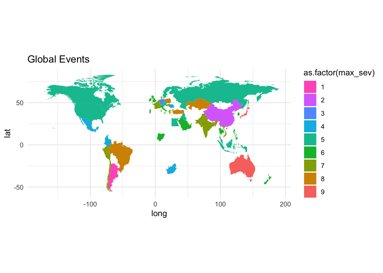
Better, but this is for all months, but not differentiating between years
library(gganimate)
gce_plot <- ggplot(
  data = world_sev,
  mapping = aes(x = long, y = lat, group = group)) +
  geom_polygon(aes(fill = as.factor(max_sev))) +
  coord_fixed(1.3) +
  # automatically map to ColorBrewer palette
  #scale_fill_distiller(type = 'qual', palette = 'BuGn', direction = -1) + # or direction=1
  scale_fill_discrete(type = 'qual', palette = 'BuGn', direction = -1) + # or direction=1
  ggtitle("Global Events") +
  theme_minimal() +
    transition_states(states=month, # year is a variable in data
  ) +
  #                  transition_length = 1,
  #                  state_length = 10) +
  enter_fade() +
  exit_fade() +
  ease_aes('linear') +
  labs(title = "Month: {closest_state}")

  animate(gce_plot,
        duration = 10, # 41 countries, 2 seconds each
        fps  =  5)

gce_plot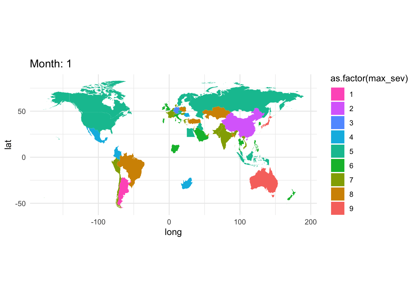
Push the envelope, this is for each event.
gce_sev_month <- gce |> group_by(month, year, cname) |>
  summarize(max_sev = max(severity,na.rm =TRUE))

world_sev_month <- left_join(gce_sev_month, world, by ="cname")library(gganimate)
gce_plot <- ggplot(
data = world_sev_month,
mapping = aes(x = long, y = lat, group = group)) +
geom_polygon(aes(fill = as.factor(max_sev))) +
coord_fixed(1.3) +
# automatically map to ColorBrewer palette
#scale_fill_distiller(type = 'qual', palette = 'BuGn', direction = -1) + # or direction=1
scale_fill_discrete(type = 'qual', palette = 'BuGn', direction = -1) + # or direction=1
ggtitle("Global Events") +
theme_minimal() +
transition_states(states=month, # year is a variable in data
) +
# transition_length = 1,
# state_length = 10) +
enter_fade() +
exit_fade() +
ease_aes('linear') +
labs(title = "Month: {closest_state}")
animate(gce_plot,
duration = 6, # 12 months, 5 years
fps = 5)
gce_plot