library(tidyverse)
library(scales) # (change labels & breaks for axes & legends)Zillow Data
Overview
- Use a function and loop to load and clean zillow data.
- Summarize the zillow data and display mean & standard deviation using error bars.
- Visualize a summary of the zillow data on a US map
- Add
ggplotdetails to make a poster-ready plot
First load these
Then prepare to grab some zillow data. Several datasets are available in the Week 8 folder. The script found there load_clean_zillow.R can be used to load & clean the data.
Data Import & Tidy
Call a script used to load & tidy the zillow data. (Note: this file lives here)
- Then you have 3 zillow datasets
nrin,yts&nra
nrin: income needed to rent, on averageyts: years to save in order to be able to buy, on averagenra: percentage spent on average house
- You have a function
clean_it(). that cleans the data - You then have a function
get_states()to select subsets of data
Load data as follows:
# load 3 zillow datasets, clean them and create a function -
source('~/t/dat309/week8/load_clean_zillow.R')
[1] "dataset yts loaded"[1] "dataset nrin loaded"[1] "dataset nra loaded"# call the function and with 2nd parameter name the variable
zyts <- clean_it(yts, "years_to_save")compare “years to save” among different states
states_yts <- zyts |> group_by(state_name) |>
          summarize(
            mean_years = mean(years_to_save, na.rm = TRUE),
            # standard deviation
            sd_years = sd(years_to_save, na.rm = TRUE),
            # what's your n?
            n = n())

# look at the beginning of the data
states_yts |> head()
# A tibble: 6 × 4
state_name mean_years sd_years n
<chr> <dbl> <dbl> <int>
1 AK 7.22 0.611 328
2 AL 6.43 1.35 1968
3 AR 6.03 1.30 984
4 AZ 9.10 2.60 984
5 CA 12.4 3.71 4264
6 CO 9.84 2.18 1148Plot the means & standard deviations across states.
states_yts |> ggplot(
  aes(x = state_name, y = mean_years)) +
  geom_point() +
  # notice the +/- in the ymin & ymax
  geom_errorbar(aes(ymin = mean_years - sd_years, ymax = mean_years + sd_years)) +
  # instead of swapping x,y aesthetics use coord_flip()
  coord_flip()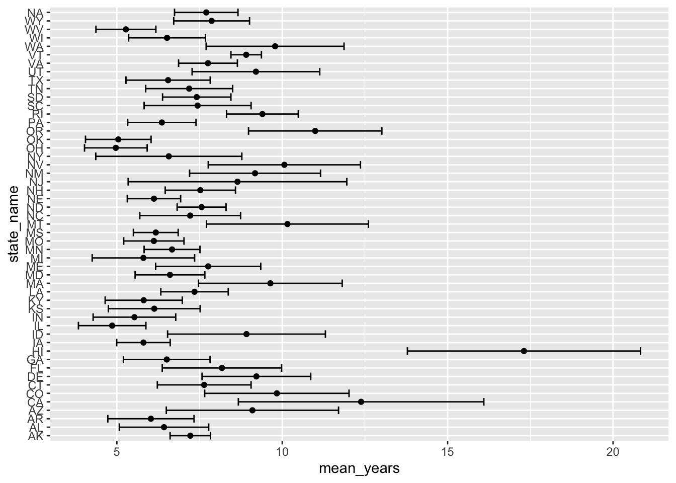
Improve by reordering the state_name
states_yts |>
  mutate(state_name = reorder(state_name,mean_years)) |>
  ggplot(
    aes(x = state_name, y = mean_years)) +
    geom_point() +
    geom_errorbar(
      aes(ymin = mean_years - sd_years,
          ymax = mean_years + sd_years)) +
    labs(x = "Number of Years of Saving before Buying") +
    coord_flip()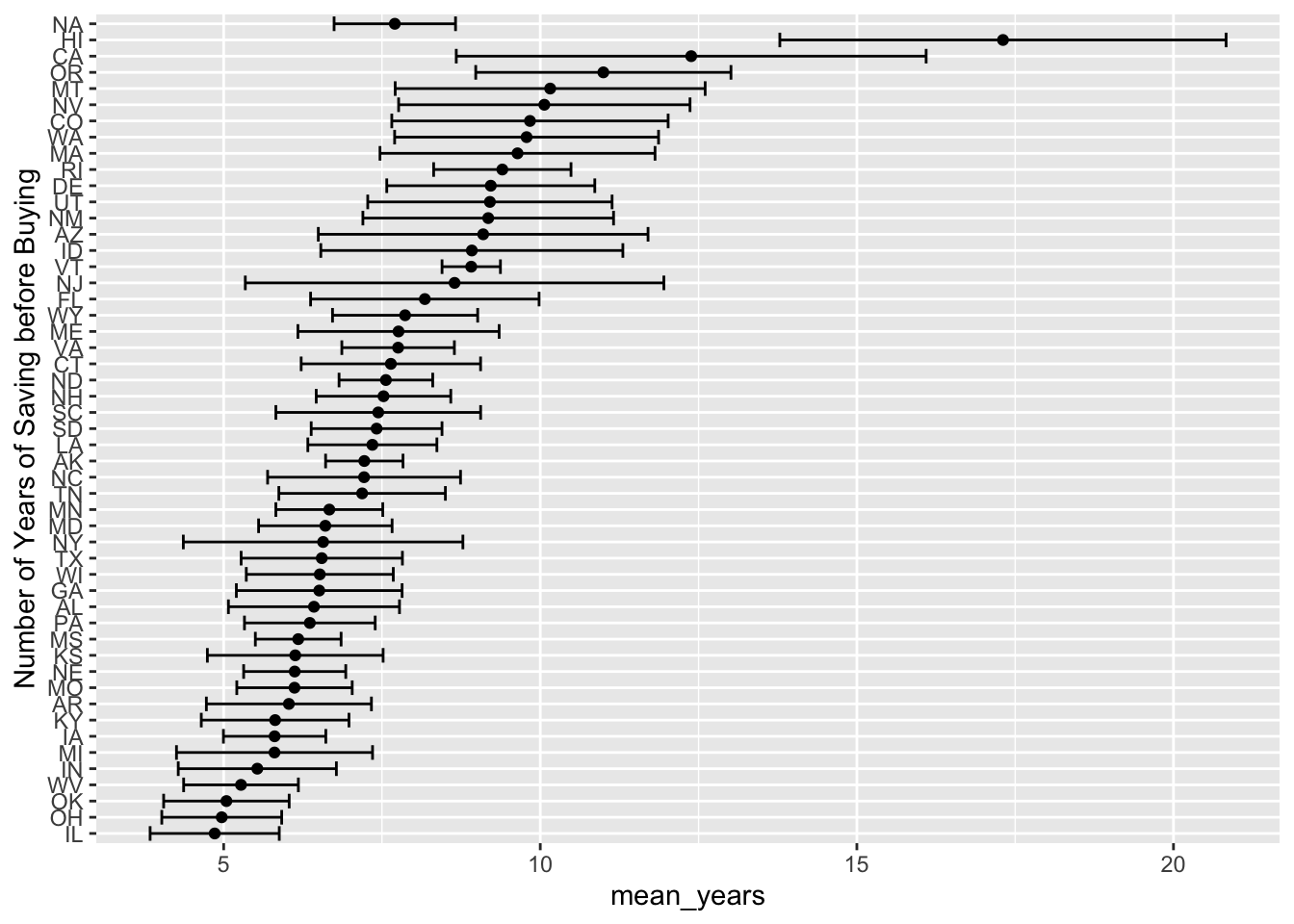
Exercises
- In the plot above replace the
NAwithNational_Averageor something similar. - Produce this plot for a single year’s worth of data.
- Use this data to color a map of the US.
We’ll tackle Exercise 3. here:
The usmap package
To make plots on a map of the US, use the package usmap link.
One key is the “fips code”, a simple code unique to US states & counties. For example,
# install.packages("usmap")
library(usmap)
# the fips() function lives in the package usmap
fips(state = 'MI', county = 'Marquette')
[1] "26103"Use the fips() function to mutate a new variable (also called fips) that the mapping utility can use for plotting.
# need a fips code to plot
states_yts <- states_yts |> mutate(fips = fips(state_name))

# this is NOT a ggplot gadget, this is why you must use quotes
# when accessing the variables in your data
plot_usmap(data = states_yts,
           values = "mean_years")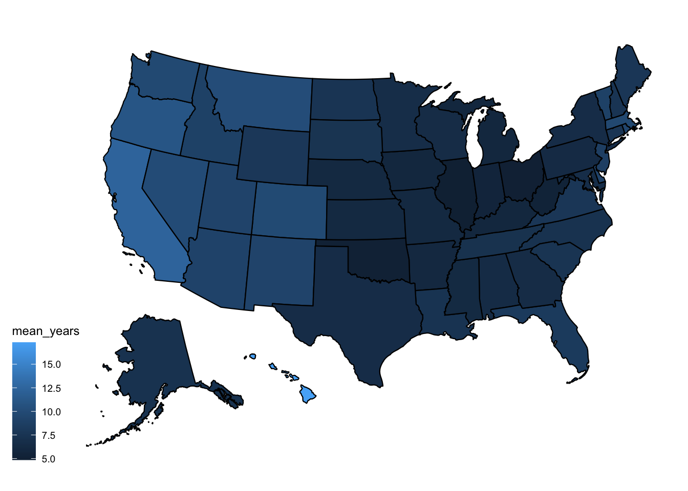
Undergo a similar analysis & exercise for different data.
Income Needed to Buy
library(scales)
# load the data
znrin <- clean_it(nrin, "income_needed")

# look at just Michigan
mi <- get_states(znrin, "MI", 200)
[1] "MI"# examine income needed vs. region
reg_mi <- group_by(mi, region_name) |>
summarize(mean_income_needed = mean(income_needed, na.rm = TRUE),
sd_income_needed = sd(income_needed, na.rm = TRUE))
reg_mi |>
mutate(region_name = reorder(region_name,mean_income_needed)) |>
ggplot(
aes(x = region_name,
y = mean_income_needed,
color = region_name)) + # associate color with region name
geom_point() + # a single point tracking the mean
geom_errorbar(
aes(ymin = mean_income_needed - sd_income_needed,
ymax = mean_income_needed + sd_income_needed)) + # for the SD
# for poster-ready plots, create good labels
labs(y = "Income",
x = "Region",
title = "Income Needed Before Buying",
subtitle = "Michigan",
caption = "Data from Zillow") +
scale_y_continuous(labels = label_dollar()) +
scale_color_viridis_d(end = .75) + # end the spectrum at greenish
theme(legend.position = "none",
axis.text.y = element_text(size = 7)) +
coord_flip()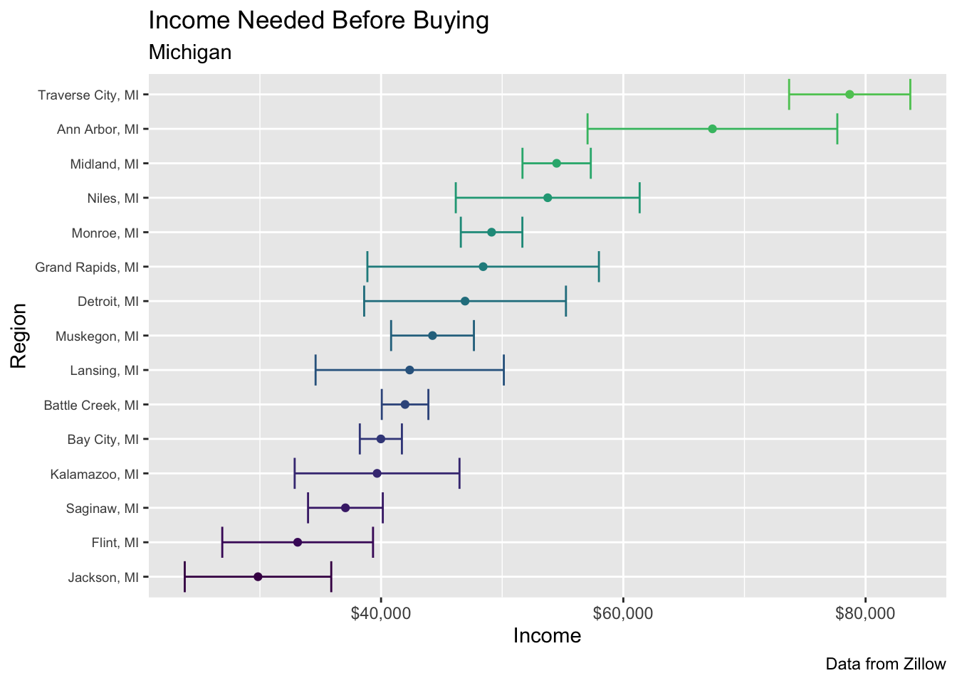
Exercise
- Repeat for the
nradata.