# save the script in your current working directory
source('load_clean_zillow.R')Zillow data
scripting, divergent bar graphs
Divergent Bar Graphs
Are used to accentuate data that is either above or below a given threshold, for example
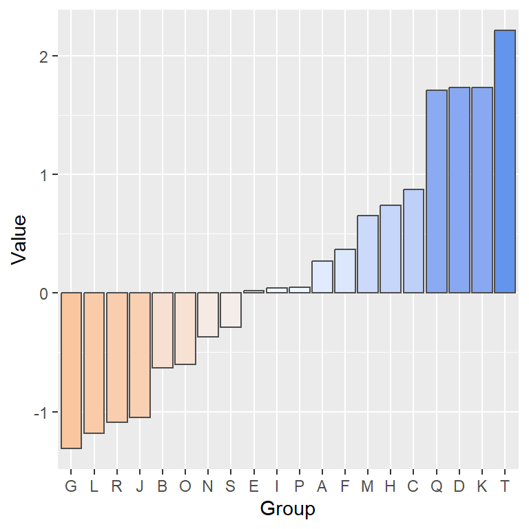
This type of graph is effective for displaying comparisons, such as deviations from an average or survey responses with “agree” and “disagree” categories.
Save/Update Loading Script
Make sure you have the load_clean script. If not, replace your version with this edited version of the load/clean script for importing zillow data: load_clean_zillow.R.
Run the script either by clicking Source or by
About the Data
New Renter Affordability:
A measure of the share of income the median household would spend to newly lease the typical rental. Typically, spending more than 30% of income on housing is considered unaffordable.
library(tidyverse)
library(scales)
Load & Clean
The nra data is the percentage of median income spent on an average house. It can be loaded by running the script below.
# load 3 zillow datasets, clean them and create a function -
source('~/t/dat309/week8/load_clean_zillow.R')
[1] "dataset yts loaded"[1] "dataset nrin loaded"[1] "dataset nra loaded"# clean Zillow data:
# Note the 2nd parameter wll be the name of a variable
znra <- clean_it(nra, "percent_spent") |>
select(-region_id, -size_rank, -region_type)Summarize Income Percentage Spent on Housing
# notice the implicit mutate below in the year=year(date)
nra_sum <- znra |> group_by(
  region_name,state_name,year=year(date)) |>
  summarize(percent_spent = mean(percent_spent))
Notice the data is still grouped, so the mutate will work group-wise and will store the result back in the original data frame
# notice the Groups: below
glimpse(nra_sum)
Rows: 4,290
Columns: 4
Groups: region_name, state_name [390]
$ region_name <chr> "Abilene, TX", "Abilene, TX", "Abilene, TX", "Abilene, T…
$ state_name <chr> "TX", "TX", "TX", "TX", "TX", "TX", "TX", "TX", "TX", "T…
$ year <dbl> 2015, 2016, 2017, 2018, 2019, 2020, 2021, 2022, 2023, 20…
$ percent_spent <dbl> 0.2286215, 0.2218714, 0.2287677, 0.2269373, 0.2318890, 0…nra_sum <- nra_sum |>
mutate(mean_percent = mean(percent_spent, na.rm = TRUE),
diff_percent = percent_spent-mean_percent)
glimpse(nra_sum)Rows: 4,290
Columns: 6
Groups: region_name, state_name [390]
$ region_name <chr> "Abilene, TX", "Abilene, TX", "Abilene, TX", "Abilene, T…
$ state_name <chr> "TX", "TX", "TX", "TX", "TX", "TX", "TX", "TX", "TX", "T…
$ year <dbl> 2015, 2016, 2017, 2018, 2019, 2020, 2021, 2022, 2023, 20…
$ percent_spent <dbl> 0.2286215, 0.2218714, 0.2287677, 0.2269373, 0.2318890, 0…
$ mean_percent <dbl> 0.2422726, 0.2422726, 0.2422726, 0.2422726, 0.2422726, 0…
$ diff_percent <dbl> -1.365105e-02, -2.040124e-02, -1.350486e-02, -1.533527e-…Randomly select a state by sampling the pre-existing list of state names:
# pull() extracts the data from the tibble() structure
nra_sum |> ungroup() |> select(state_name) |> slice_sample() |> pull()
[1] "MI"First Main Plot
Grab one sample region from a state for the data to plot
# the random sample trick
rand_state = nra_sum |> ungroup() |>
  select(state_name) |> slice_sample() |> pull()

# save the data to use later in ggtitle
temp <- nra_sum |> ungroup() |> get_states(rand_state,1)
[1] "ID"temp |>
ggplot(
# fill with color whether + or -
aes(x=year, y = diff_percent, fill = diff_percent > 0)) +
# use stat = "identity" when aes() has both x & y
geom_bar(stat = "identity", alpha = .9) +
ggtitle(paste0("Housing Financial Burden: ", temp$region_name)) +
scale_fill_viridis_d(end=.75) +
# remove the legend
theme(legend.position = "none") +
labs(y = "Difference From Mean",
x = "Year") +
# make the axis display all years
scale_x_continuous(breaks = seq(2015,2054,by=1))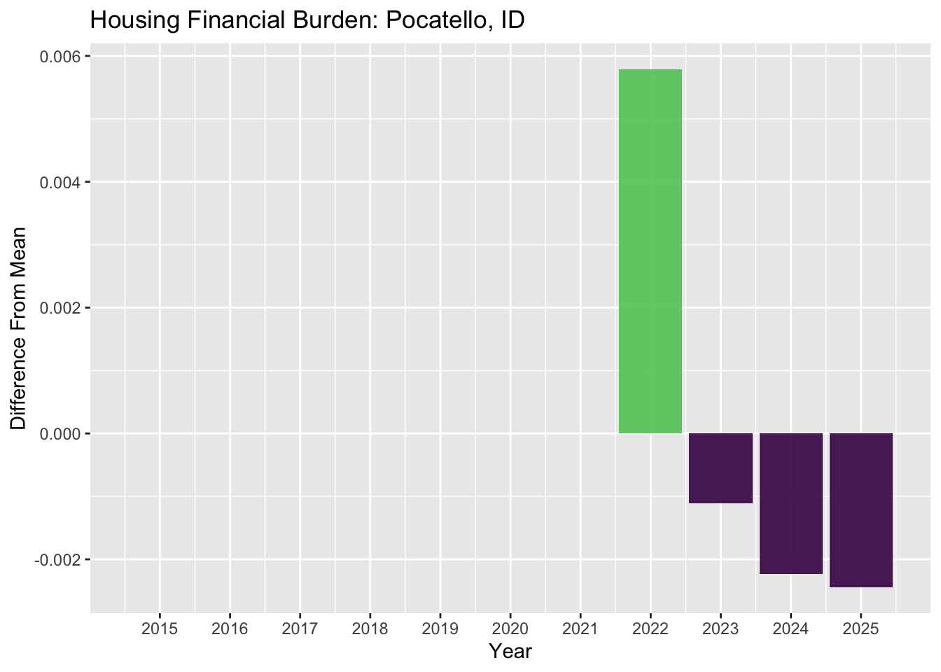
Compare Summaries That Diverge From a Target
For the year 2024, find the overall percentage spent on income for each region in your a subset of US regions.
znra_sub <- get_states(znra,c("NC","MI","NY","WA", "CA"),3)[1] "NC"
[1] "MI"
[1] "NY"
[1] "WA"
[1] "CA"# Filter for a date range
start_date <- as_date("2024-01-01")
end_date <- as_date("2024-12-31")
# create a summary of the subset of nra data
znra_sub_sum <- znra_sub |>
filter(
date >= start_date,
date <= end_date) |>
group_by(region_name) |>
summarize(
percent_on_housing = mean(percent_spent, na.rm = TRUE)
)House Poor: The 30% Rule
Spending more than 30% of your income on housing is widely considered unaffordable. To accentuate affordability, create a new variable that is negative if the percentage spent is less than 30% and positive if greater.
# afford_index is positive if the percentage > 30%
# afford_index is negative if the percentage < 30%
znra_sub_sum <- znra_sub_sum |> mutate(afford_index = case_when(
  percent_on_housing <= .3 ~ -percent_on_housing,
  percent_on_housing > .3 ~ percent_on_housing,
))
Use afford_index as a central point from which to plot a divergent bar graph.
# grab n=20 samples for the data to plot
znra_sub_sum |> slice_sample(n=20) |>
  ggplot(
      aes(x=afford_index, y = region_name, fill = afford_index > 0)) +
  geom_bar(stat = "identity")  +
  theme(legend.position = "none") +
  scale_fill_viridis_d(end=.75)
This is also an option for plotting.
Plot positive values
znra_sub_sum |> slice_sample(n=20) |>
  ggplot(
      aes(x=afford_index, y = region_name, fill=afford_index>0)) +
  geom_bar(stat = "identity") +
  scale_x_continuous(labels = abs) +
  theme(legend.position = "none") +
scale_fill_viridis_d(end=.75) 
Plotting percents
znra_sub_sum |> slice_sample(n=20) |>
  ggplot(
      aes(x=afford_index, y = region_name,fill=afford_index>0)) +
  geom_bar(stat = "identity") +
  theme(legend.position = "none") +
  scale_fill_viridis_d(end=.75) +
scale_x_continuous(labels = percent) 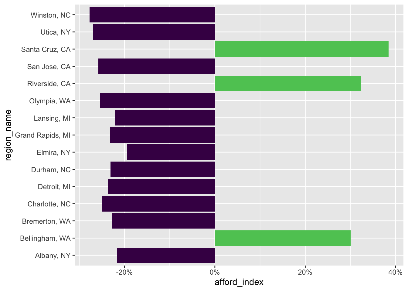
Keep it simple
znra_sub_sum |> slice_sample(n=20) |>
  ggplot(
      aes(x=percent_on_housing,
          y = region_name,fill=percent_on_housing>0)) +
  geom_bar(stat = "identity", fill = "steelblue") +
  theme(legend.position = "none") +
  scale_fill_viridis_d(end=.75) +
  # see colors()
#  scale_x_continuous(labels = percent) +
  geom_vline(xintercept = 0.3, color = "red",
             linetype = 1, size = 1, alpha = 0.5) +
  labs(x="Percentage of Median Income Spent on Housing",
       y="Region") +
  theme_minimal()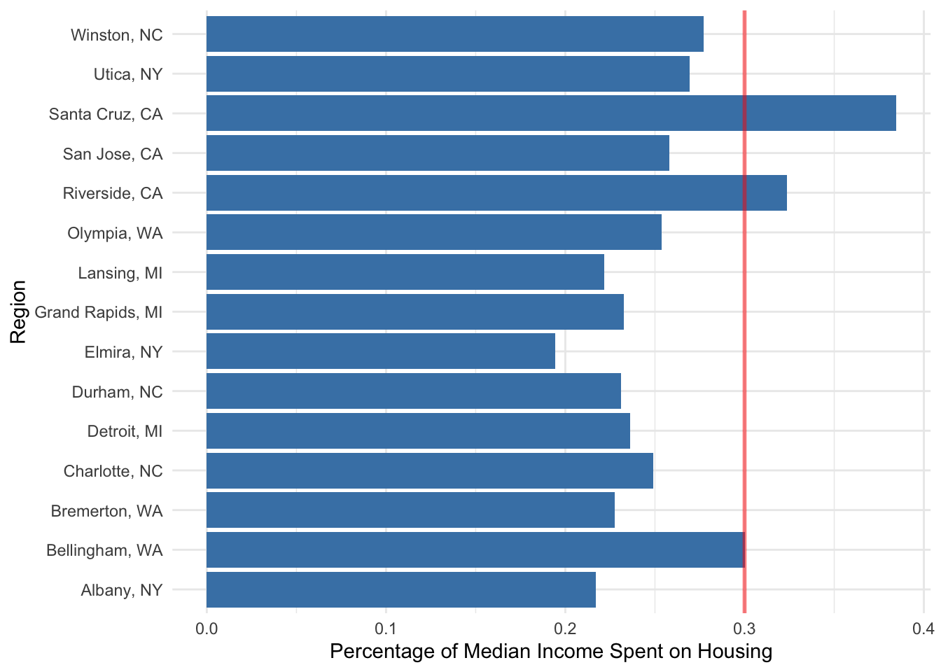
Years To Save
# call the function and with 2nd parameter name the variable
zyts <- clean_it(yts, "years_to_save")
zyts_sub <- get_states(zyts,c("NC","MI","NY","WA", "WY"),3)[1] "NC"
[1] "MI"
[1] "NY"
[1] "WA"
[1] "WY"Exercise:
For the year 2024, find the average number of ‘years to save’ for each region in your chosen subset of US regions. Create a plot to visualize this data.
# Filter for a date range
start_date <- as_date("2024-01-01")
end_date <- as_date("2024-12-31")

# create a summary of the subset of yts data
zyts_sub_sum <- zyts_sub |>
  filter(
    date >= start_date,
    date <= end_date) |>
  group_by(region_name) |>
      summarize(
          years = mean(years_to_save, na.rm = TRUE)
        )