---
title: "R for Data Science: Chapters 2.1 - 2.2"
subtitle: "Data 309"
date: today
format: html
toc: true
toc-title: Sections 2.1 - 2.2
---
## RStudio
[Cheatsheet](https://ucdavis-bioinformatics-training.github.io/Oct2017-ILRI-Workshop/Cheat_Sheets/rstudio-IDE-cheatsheet.pdf)
## Make a script (or R - notebook) for each class
Shortcut: `Ctrl/Cmd - shift - N` or
point-and-click as shown
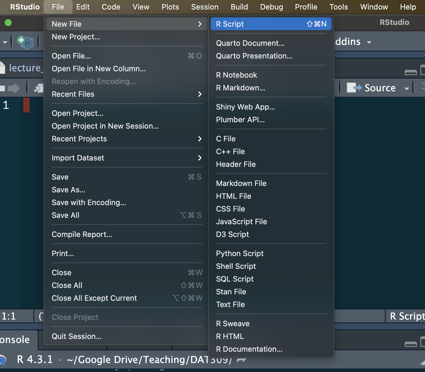
Use comments to organize your work!
## Data Science Workflow
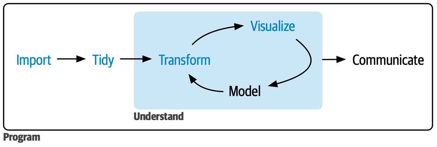
What are the main tools of data science? One answer to this question is the following diagram.
## Dataset: Gapminder
Let's explore a new dataset called gapminder. It concerns world development and is found at ()
**Gapminder**: *Fight devastating ignorance with a fact-based worldview everyone can understand.*
```{r}
#| eval: FALSE
install.packages("gapminder")
```
```{r, message=FALSE, warning=FALSE}
library(gapminder)
library(tidyverse)
```
Below we look at a transposed version of the data with `glimpse`, which lives in the **dplyr** package, included in the tidyverse. Or `View()`, or or just type `gapminder`.
```{r}
glimpse(gapminder)
```
We see that this dataset has variables: countries, continents, year, life expectancy, population and GDP per capita.
## Useful exploratory tips
1. Access variables directly `gapminder$country` or attach the data to our workspace to avoid the harsh syntax with `attach(gapminder)`.
2. Then we can see all the countries listed with `unique(country)`.
3. Recall, `?gapminder` is helpful to learn about the dataset.
4. `names(gapminder)` lists all the variable names of gapminder
## Grammar of Graphics / ggplot syntax
One of the main ways to visualize data in R is **ggplot2**, which utilizes the conceptual framework of the **grammar of graphics**. In English, grammar dictates that each sentence must have a subject and verb. In the grammar of graphics, each plotting element must have **data**, **aesthetics** and a **geometry**. Good sentences often have prepositions, adverbs, etc., and good graphics have more layers as well.
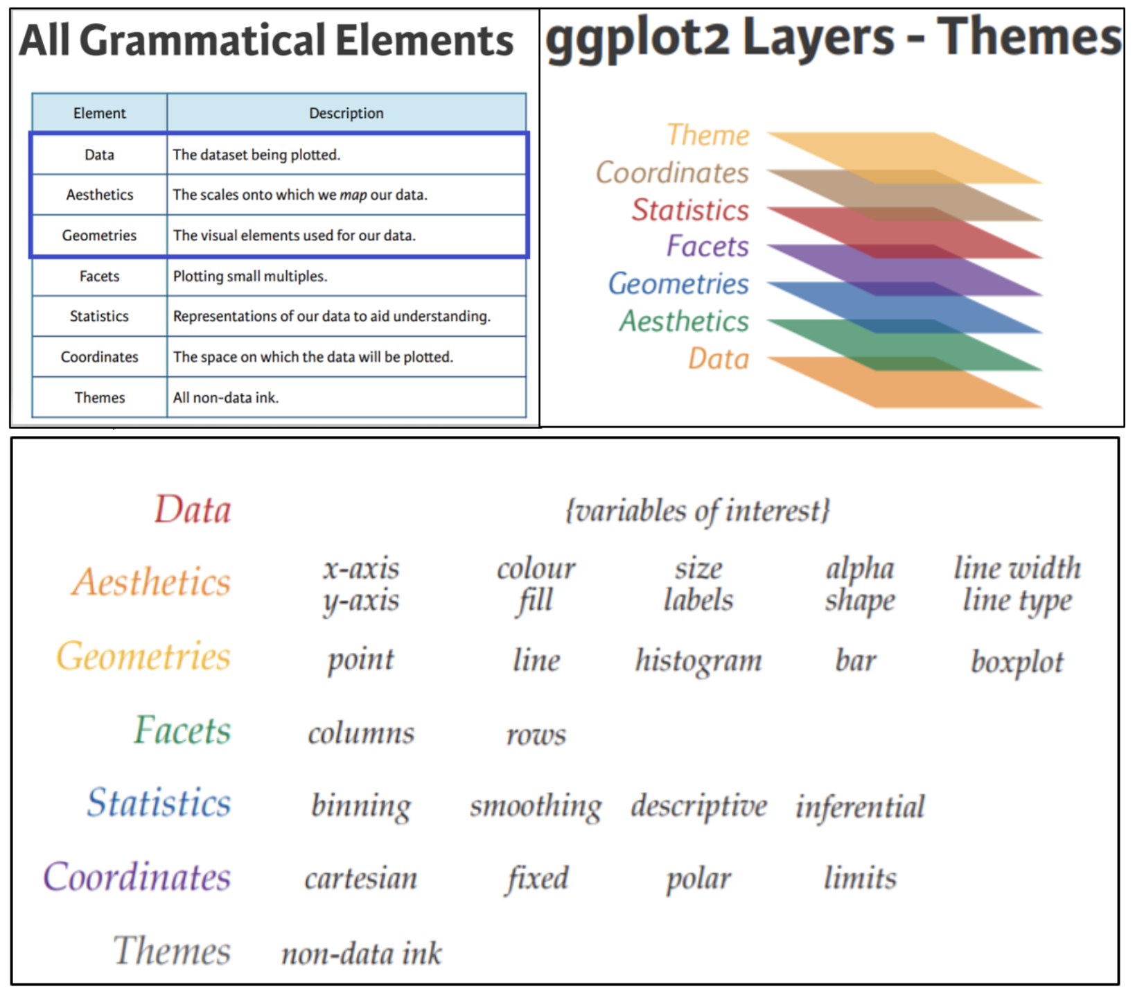
Our first input to ggplot is always a data table. Notice below, there is nothing to see, but also no error. It's just a blank plot.
```{r}
ggplot(data = gapminder)
```
The second input is a mapping argument called `aes()` or aesthetic. (Another blank plot.)
```{r}
ggplot(
data = gapminder,
aes(x = year)
)
```
Only with the third layer do we get something interesting.
```{r}
ggplot(
data = gapminder,
aes(x = year, y = lifeExp)) +
geom_point()
```
This is a pretty bad plot. We learn something, but we could learn the same with less. Scatterplots are best used to compare **numerical data**, not categorical. The variable GDP (gross domestic product) is numerical, so let's see if life expectancy is possibly related to GDP per capita.
```{r}
ggplot(
data = gapminder,
aes(x = gdpPercap, y = lifeExp)) +
geom_point()
```
In the above plot, can you determine a relationship between GDP and Life Expectancy? Let's see if time plays a role.
```{r}
ggplot(
data = gapminder,
aes(x = gdpPercap, y = lifeExp, color = year)) +
geom_point()
```
In the above, we included a 3rd variable as color. Now apply a fourth layer, a statistic. In this case a curve of best fit.
```{r}
ggplot(
data = gapminder,
aes(x = gdpPercap, y = lifeExp)) +
geom_point(aes(color = year)) +
geom_smooth()
```
We improve the graphic by adding labels such as a title, subtitle and more with `labs()`. Do `?labs()` to explore possibilities. How could the plot below be improved even further?
```{r}
ggplot(
data = gapminder,
aes(x = gdpPercap, y = lifeExp)) +
geom_point(aes(color = year)) +
labs(title = "GDP vs. Life Expectancy",
y = "GDP per capita",
subtitle = "From 1960 to 2000")
```
## Assignment 2
(i) Edit the file `lecture_1.qmd` in the [week1](http://euclid.nmu.edu/~joshthom/teaching/dat309/week1/) folder to contain responses to the following: (note you need to "render" the .qmd file into an .html file)
(ii) Recreate the final plot above but with a different mapping, such as GDP as a function of year and color by continent.
(iii) What happens when you try to color by country?
(iv) What makes some mappings more useful than others?