Code
library(tidyverse)
atus <- read_csv("https://euclid.nmu.edu/~joshthom/dat309/data/ATUS/atusrost_2025.dat") |>
janitor::clean_names()How many different planes are there in the flights data? How many airports?
Did every plane visit every airport?
Create a data frame of the most delayed flight (departure) from each airport.
cut()cut divides the range of x into intervals and codes the values in x according to which interval they fall.
Use cut()
library(tidyverse)
atus <- read_csv("https://euclid.nmu.edu/~joshthom/dat309/data/ATUS/atusrost_2025.dat") |>
janitor::clean_names()df <- mutate(atus, work_level = cut(act_work,
breaks = c(0,60,60*9,60*24),
labels = c("low","medium","high")),
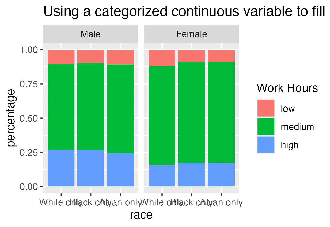
.before = 1)cut()cut() to create a category of based on the numerical data of act_work: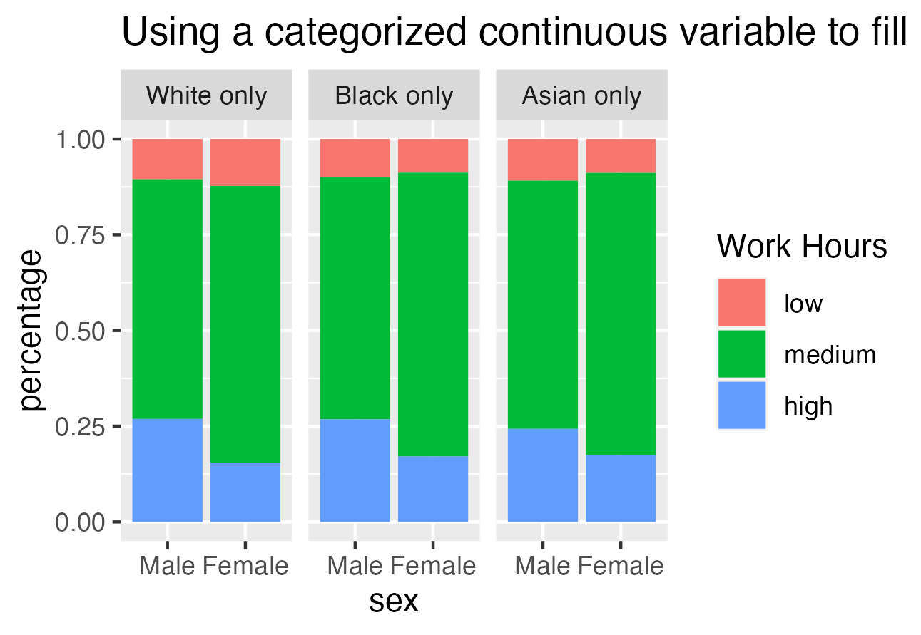
Which is the better plot?