Insert R-chunk with: ctrl + shift + i or cmd + shift + i (Mac)
Use ctrl + enter or cmd + enter to run the code in the current chunk.
Use ctrl + shift + enter or cmd + shift + enter to run all code in the current document.
Useful tips
head()
Let’s look at some of the datasets installed in R. For example, us_rent_income is a dataset that comes with the ggplot2 package. To see the first few rows of this dataset, we can use the head() function.
library(tidyverse) # we'll do this, pretty much every time we use R
── Attaching core tidyverse packages ──────────────────────── tidyverse 2.0.0 ──
✔ dplyr     1.2.1     ✔ readr     2.2.0
✔ forcats   1.0.1     ✔ stringr   1.6.0
✔ ggplot2   4.0.3     ✔ tibble    3.3.1
✔ lubridate 1.9.5     ✔ tidyr     1.3.2
✔ purrr     1.2.2
── Conflicts ────────────────────────────────────────── tidyverse_conflicts() ──
✖ dplyr::filter() masks stats::filter()
✖ dplyr::lag()    masks stats::lag()
ℹ Use the conflicted package (<http://conflicted.r-lib.org/>) to force all conflicts to become errors
data() # remind ourselves of the datasets that come with Rhead(us_rent_income) # see the first few rows of the dataset
We note the NAME variable is a character vector, while the estimate variable is a numeric vector. We can use the class() function to check this. It is contains redundancies. To see only the unique values of a variable, we can use the unique() function.
class(us_rent_income$NAME) # check the class of the variable NAME
[1] "character"
class(us_rent_income$estimate) # check the class of the variable estimate
[1] "numeric"
unique(us_rent_income$NAME) # see the unique values of the variable NAME
The gapminder dataset is a collection of data about countries around the world, including information about life expectancy, GDP per capita, and population. Learn more about the dataset: (https://www.gapminder.org/)
Gapminder: Fight devastating ignorance with a fact-based worldview everyone can understand.
Install the dataset. This step is like downloading a file to your computer. You only need to do this once.
pak::pkg_install("gapminder") # note the code below also works and is commonly found on the web# install.packages("gapminder")
To get files from your computer into R, we load the libraries as below. This step is like opening a file on your computer. You need to do this every time you start a new R session.
library(gapminder)
Below we look at a transposed version of the data with glimpse, which lives in the dplyr package, included in the tidyverse. Or View(), or or just type gapminder.
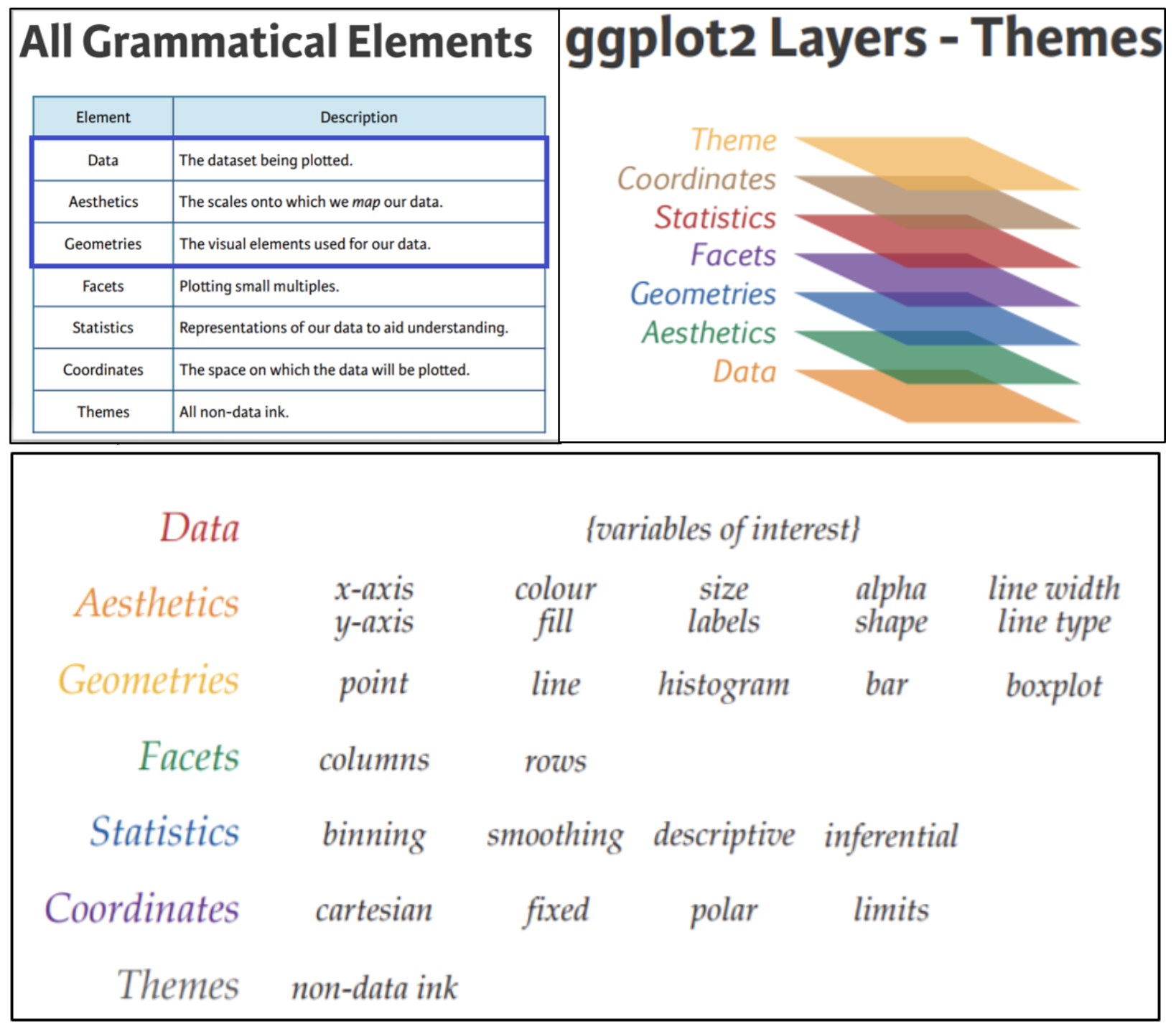
One of the main ways to visualize data in R is ggplot2, which utilizes the conceptual framework of the grammar of graphics. In English, grammar dictates that each sentence must have a subject and verb. In the grammar of graphics, each plotting element must have data, aesthetics and a geometry. Good sentences often have prepositions, adverbs, etc., and good graphics have more layers as well.
Figure: ggplot2 layers
This example shows some layers of a ggplot2 graphic. We include the line numbers in the code so you can see which lines of code corresponds to which layer in the graphic.
Line 1 creates a plot
Line 2 adds the data layer
Line 3 adds the aesthetics layer
Line 4 adds the geometry layer
Line 5 adds a layer modifying the theme
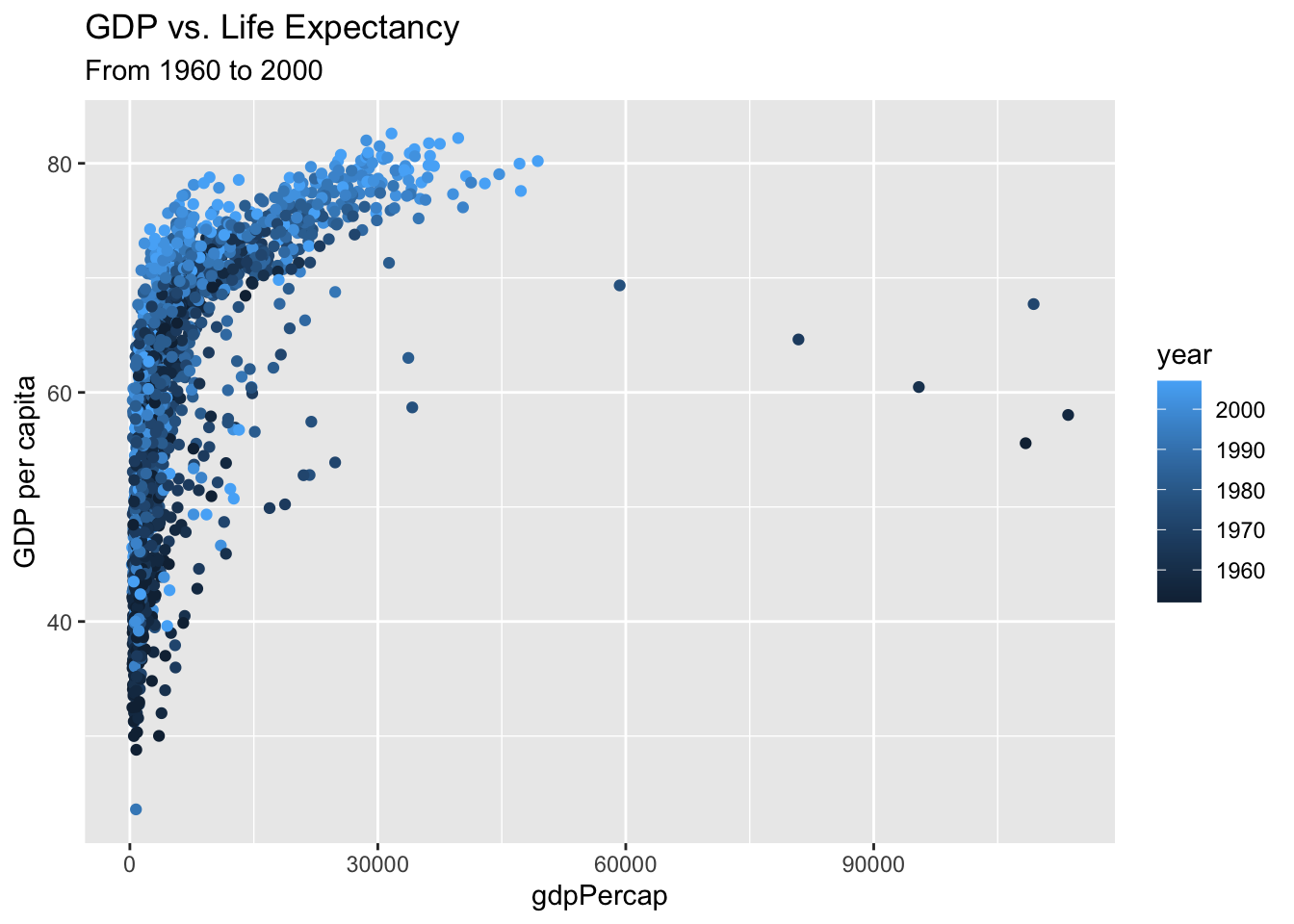
ggplot(data = gapminder, # dataaes(x = gdpPercap, y = lifeExp)) +geom_point(aes(color = year)) +labs(title ="GDP vs. Life Expectancy", y ="GDP per capita", subtitle ="From 1960 to 2000")
The first input to ggplot is always a data table. Notice below, there is nothing to see, but also no error. It’s just a blank plot.
ggplot(data = gapminder)
The second input is a mapping argument called aes() or aesthetic. (Another blank plot.)
ggplot(data = gapminder,aes(x = year))
Only with the third layer do we get something interesting.
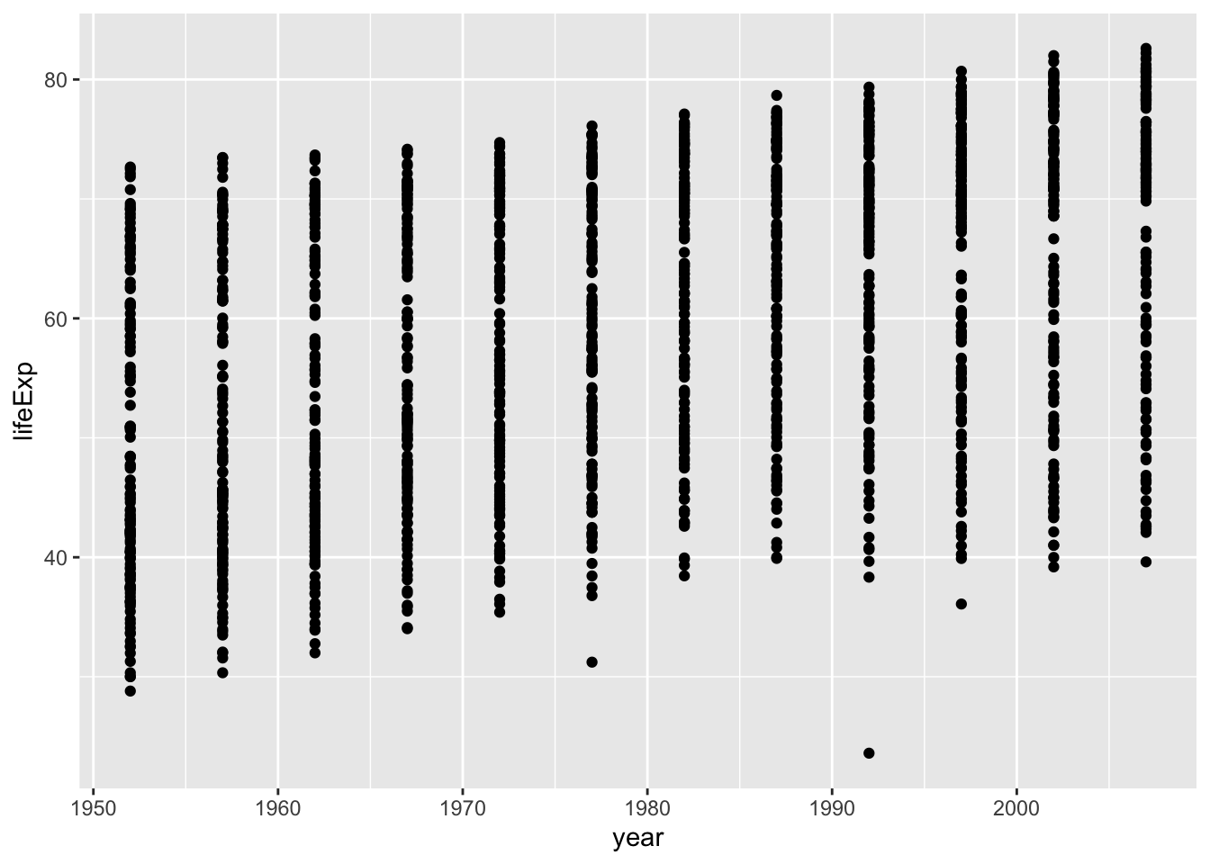
ggplot(data = gapminder,aes(x = year, y = lifeExp)) +geom_point()
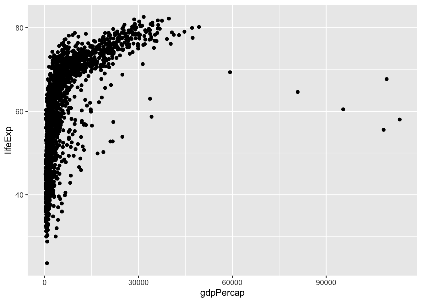
This is a pretty bad plot. We learn something, but we could learn the same with less. Scatterplots are best used to compare numerical data, not categorical. The variable GDP (gross domestic product) is numerical, so let’s see if life expectancy is possibly related to GDP per capita.
ggplot(data = gapminder,aes(x = gdpPercap, y = lifeExp)) +geom_point()
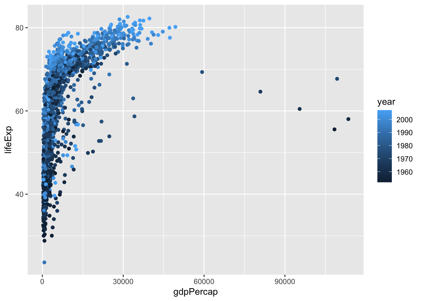
In the above plot, can you determine a relationship between GDP and Life Expectancy? Let’s see if time plays a role.
ggplot(data = gapminder,aes(x = gdpPercap, y = lifeExp, color = year)) +geom_point()
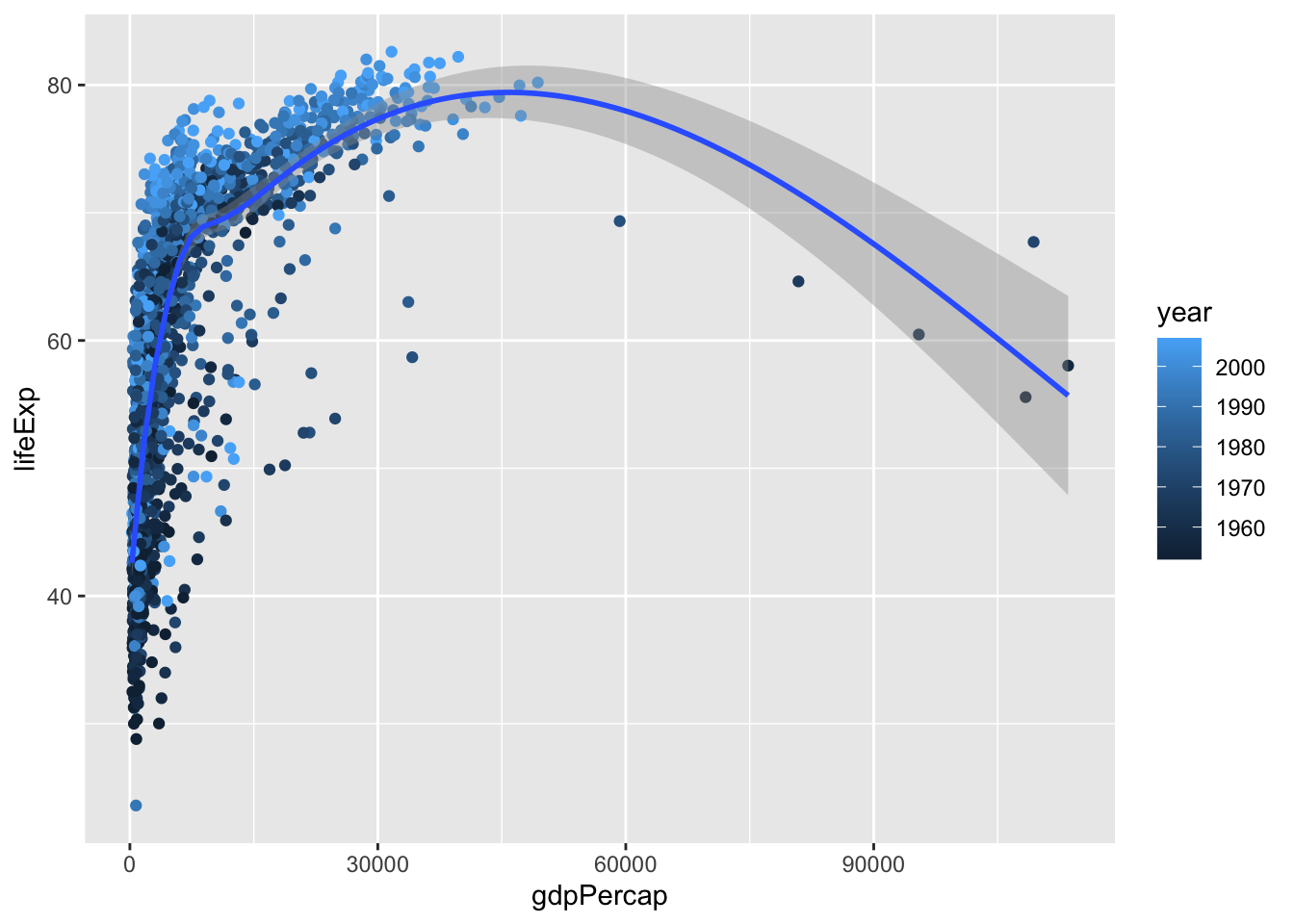
In the above, we included a 3rd variable as color. Now apply a fourth layer, a statistic. In this case a curve of best fit.
`geom_smooth()` using method = 'gam' and formula = 'y ~ s(x, bs = "cs")'
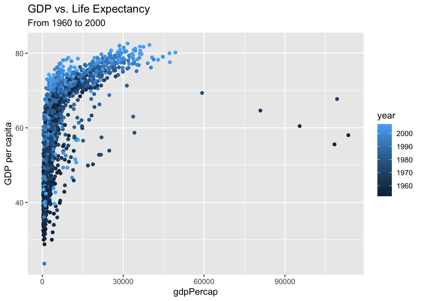
We improve the graphic by adding labels such as a title, subtitle and more with labs(). Do ?labs() to explore possibilities. How could the plot below be improved even further?
ggplot(data = gapminder,aes(x = gdpPercap, y = lifeExp)) +geom_point(aes(color = year)) +labs(title ="GDP vs. Life Expectancy", y ="GDP per capita", subtitle ="From 1960 to 2000")
Assignment 2
Due: Midnight, Friday, 9/4/2026
Create a .qmd file to contain responses to the following: (note you need to “render” the .qmd file into an .html file)
Recreate the final plot above but with a different mapping, such as GDP as a function of year and color by continent.